Healing Through Design: A Case Study in Pediatric Excellence
The National Cherry Blossom Festival

Digital poster of the National Cherry Blossom Festival
Role
Brand designer
Project Type
Brand identity
Duration
6 weeks
Deliverables
Logo, Poster, Stationery, Mockups, Merch,
Prologue
Problems
The National Cherry Blossom Festival was a major cultural event that draws national and international visitors to Washington, D.C.
It deserved a brand identity as bold and vibrant as the festival itself.
The goal was to honor its historical roots while creating something new that resonated with people across all cultures.
The previous brand was inadequate. it failed to capture the full value of what this organization actually offers.
The academic side of play was completely overlooked. This isn't just a museum; it's a library, a preschool, an educational institution, and home to a butterfly garden. That's a lot to leave off the table.
Marketing to one demographic left money on the table and missed opportunities. The brand wasn't advocating its own mission or communicating the real value of play.
Objectives
My job was to take an 1912 event and make it appeal to a 2025 modern audience.
The challenge was honoring over a century of history and remixing the brand into something new.
The new brand system needed to work everywhere; logos, posters, stationery, merchandise, and digital touch points.
Unifying the National Museum of Play brand under one umbrella. A flexible design system that can be applied to all the institutions.
Representing the idea of playfulness; The challenge of communicating with subtlety instead of the obvious.
Advocating its mission of representing the history and the study of play that promotes the educational institutions and the preschool.
Goals
Honoring the Japan-American cultural ties and Washington DC's identity while making it feel relevant for today’s audience.
Build a complete design system from the ground up; logos, festival posters, stationery, merchandise, and mockups.
Making a brand captures and appreciates what the organization offers.
Making sure this rebrand appeals to adults, too. People do appreciate clever jokes and play isn’t just physical; it’s cognitive as well.
Building an identity that promotes its objectives, meets its goals, and builds rapport with its audiences.
“Put a quote or an excerpt of your research paper here.”
Define
Research
Create
Test
Define
1
The cherry blossom isn't just a flower. It is the national flower of Japan. It’s also the centerpiece of this major event that brings visitors from all across the world.
Sketched drawings of flowers, stars and fireworks to explore themes of joy and celebration.
The Museum was dedicated to the toy collection of philanthropist Margaret Woodbury Strong. It has dolls and expanded its collection to include video games and pinball machines.
The organization writes the benefits of play in scientific journals but why isn’t this being reflected in their brand?
Having a brand wasn’t enough because it needed a whole new system.
2
Equipping them with a cohesive visual system that communicate its brand across all audiences.
Ensuring the design is accurate in its mission and identifying the organization and its visual language.
The museum's history and academic work was being left out. Aiming to unify the relationship between the museum and the institutions.
Showing playfulness and marketing it successfully to 2 opposing demographics.
Approaching this project as a challenge to communicate play that covers these areas.

Rough sketch of Cherry Blossoms and fireworks
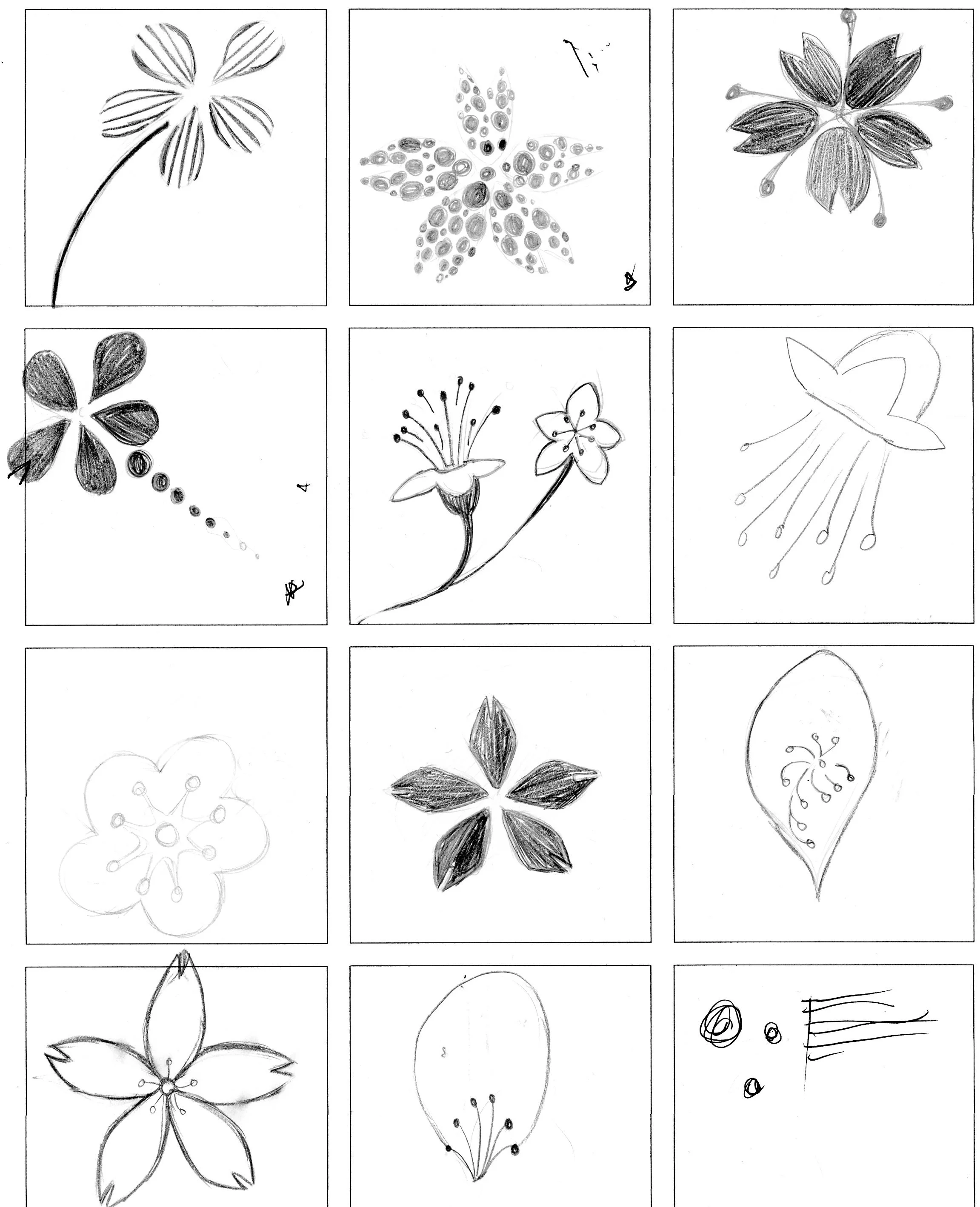
Rough sketch of Cherry Blossoms and fireworks
Research
3
Using word association and spider mapping to explore the relationships between Japan, the USA, Washington D.C., and the cherry blossoms.
These four subjects share a connection with each other through their past and present.
The cherry blossom is the foundation that I build my system from; using pink as the main color.
4
My design decision uses a bold, colorful palette using sans serif and script typefaces. San-serif show a contemporary feel while the script typeface adds a touch of antiquity.
Dug into the history of the festival to understand what it actually represents. A celebration of Japanese-American cultural exchange rooted in Washington DC.
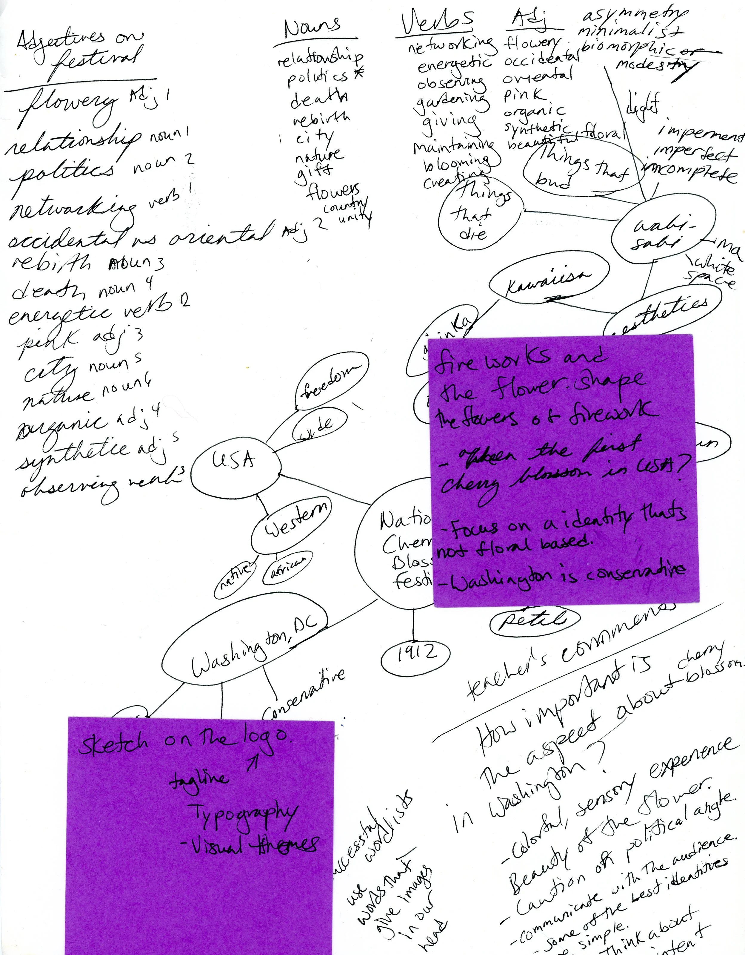
Word map and spider map of the festival
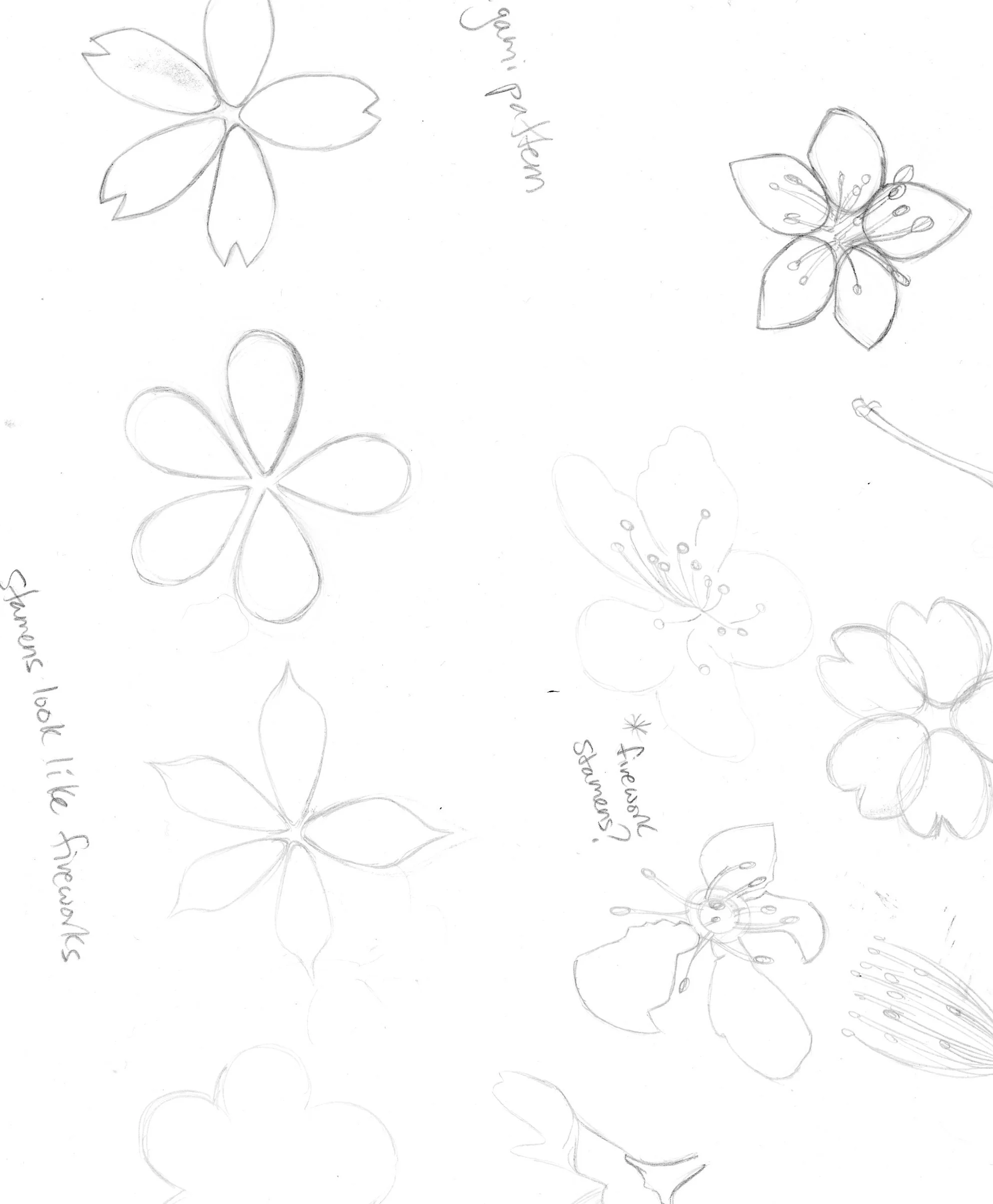
Rough sketch of Cherry Blossoms and flower petals
Create
5
It wasn't just about making things look pretty; it was using my research to communicate with clarity and cultural respect.
The festival carries huge cultural and political implications between Japan and the United States.
So, the design must celebrate that relationship
with careful consideration.It wasn’t just about making things look pretty; it was using the research to communicate with clarity.
6
The Deliverables included digital logos, posters, stationery, merchandise, and mockups. It’s built to communicate consistently across all touch points.
I admired how the previous brand campaign paired sans serif and script typefaces effectively, so I continued the trend and made it my own.
7
Using different hues of pink to create a bold and colorful experience centered entirely around the cherry blossom.
Simplicity was always the goal. Some of the strongest brand identities in the world are the most subtle. Cherry blossoms are already beautiful enough to carry the design on their own.
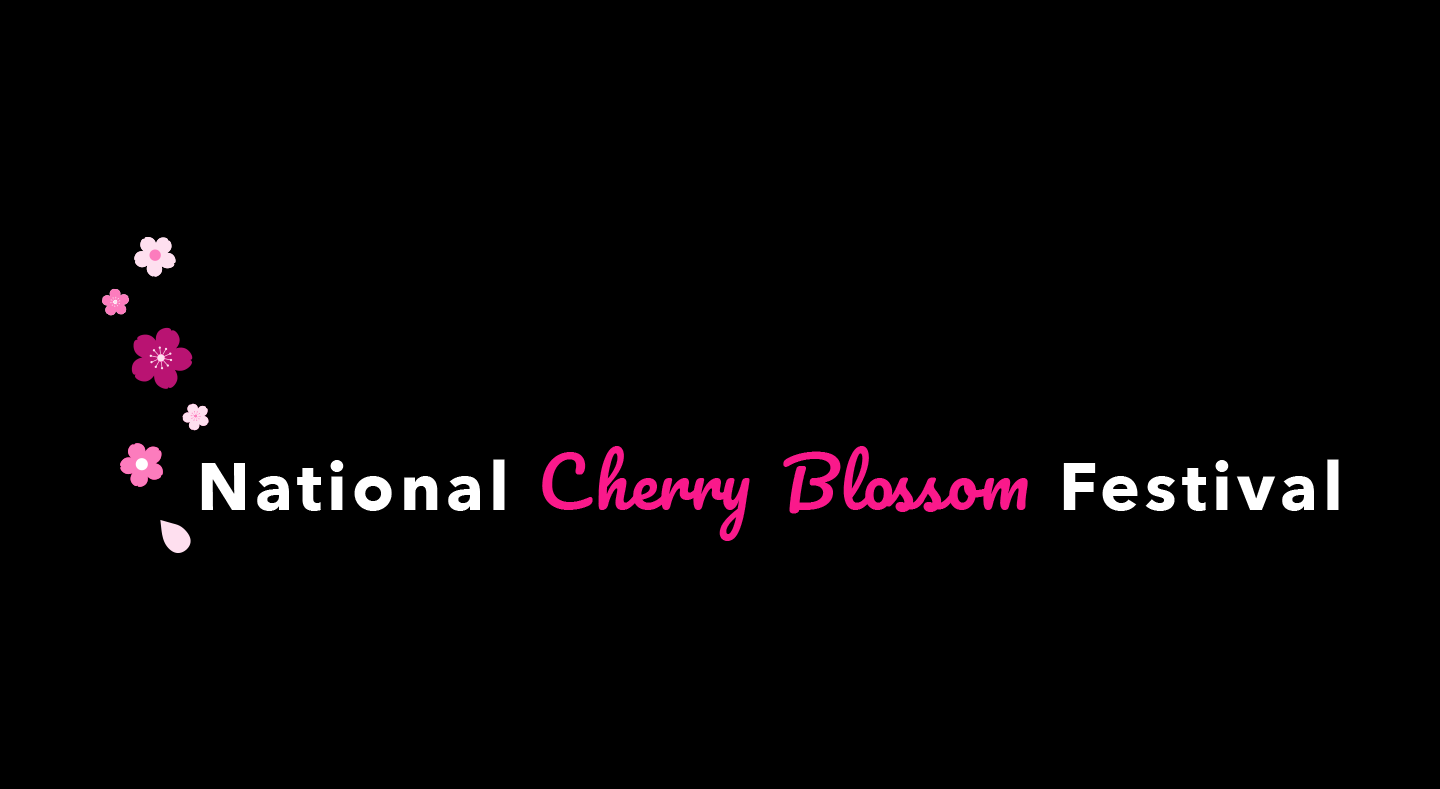
Final logo for the National Cherry Blossom Festival; a floral design on a dark background
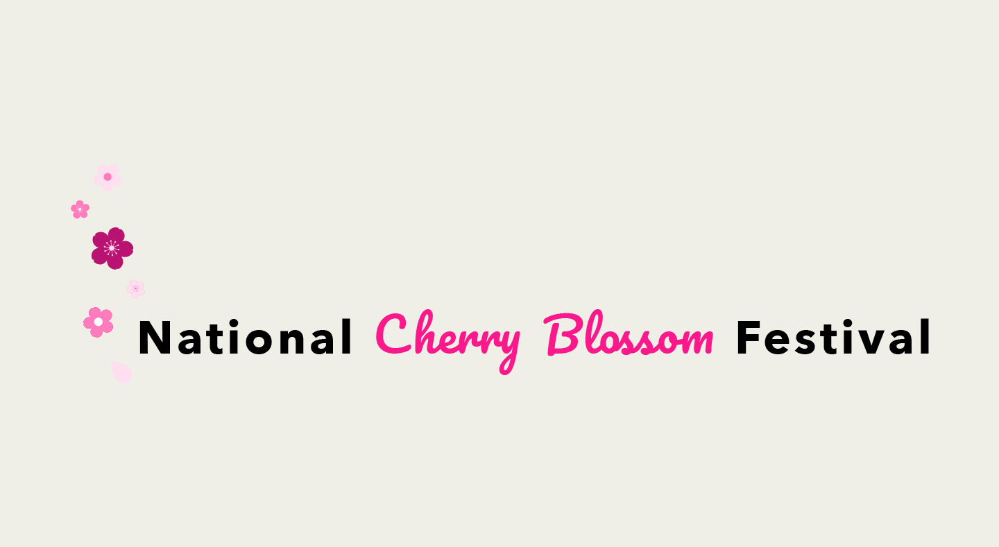
Final logo for the National Cherry Blossom Festival; a floral design on a light background
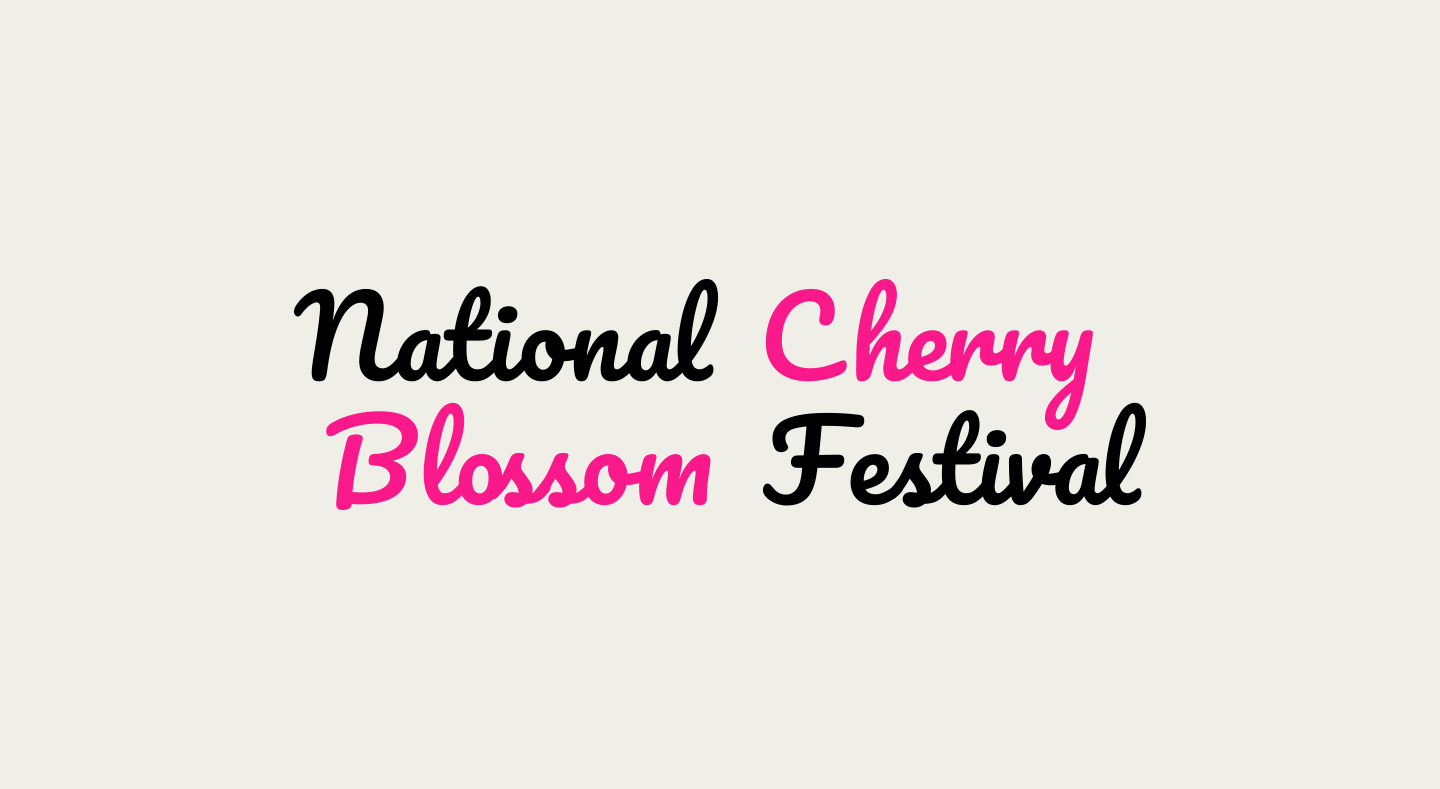
Final logo for the National Cherry Blossom Festival; a Cursive design on a light background
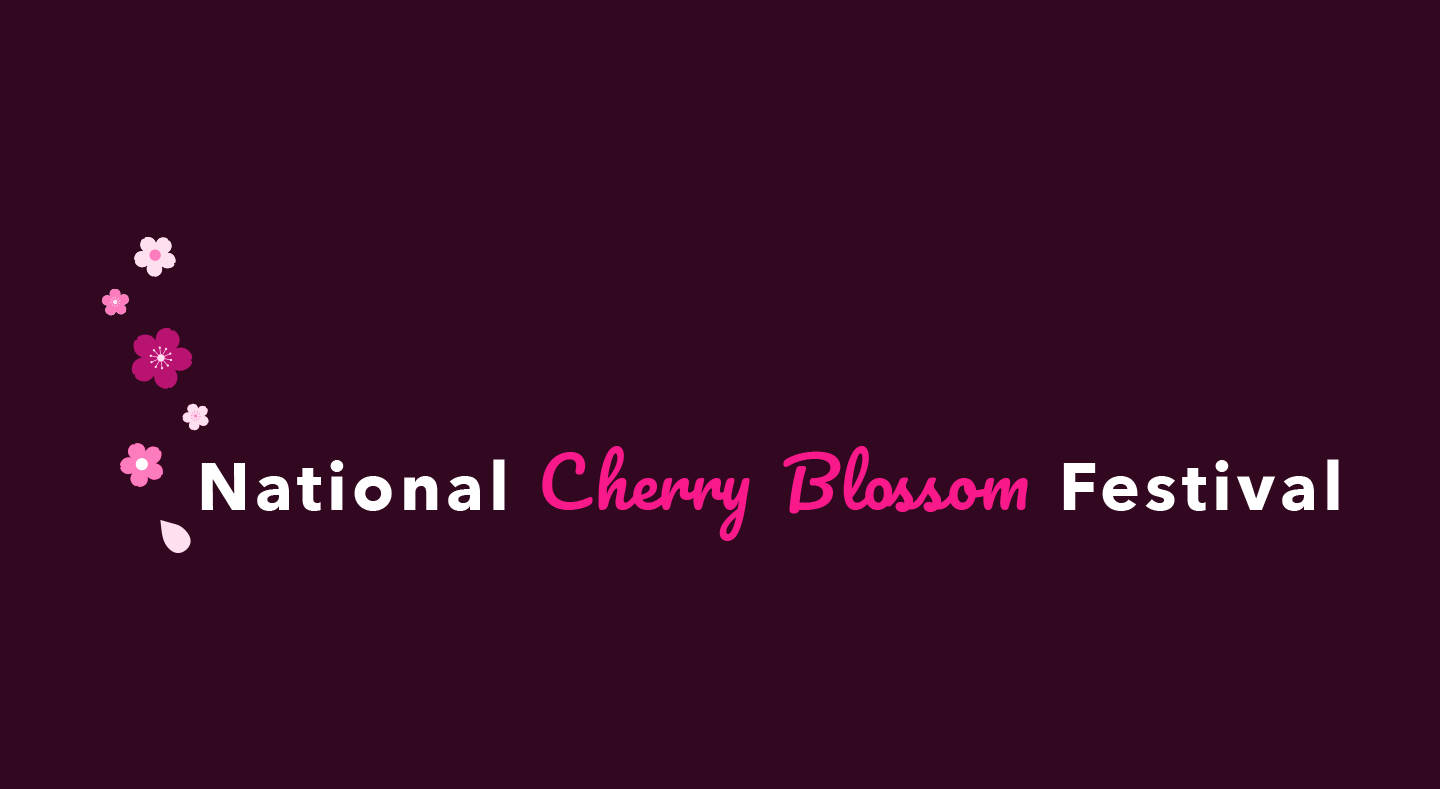
Final logo for the National Cherry Blossom Festival; a floral design on a burgundy background
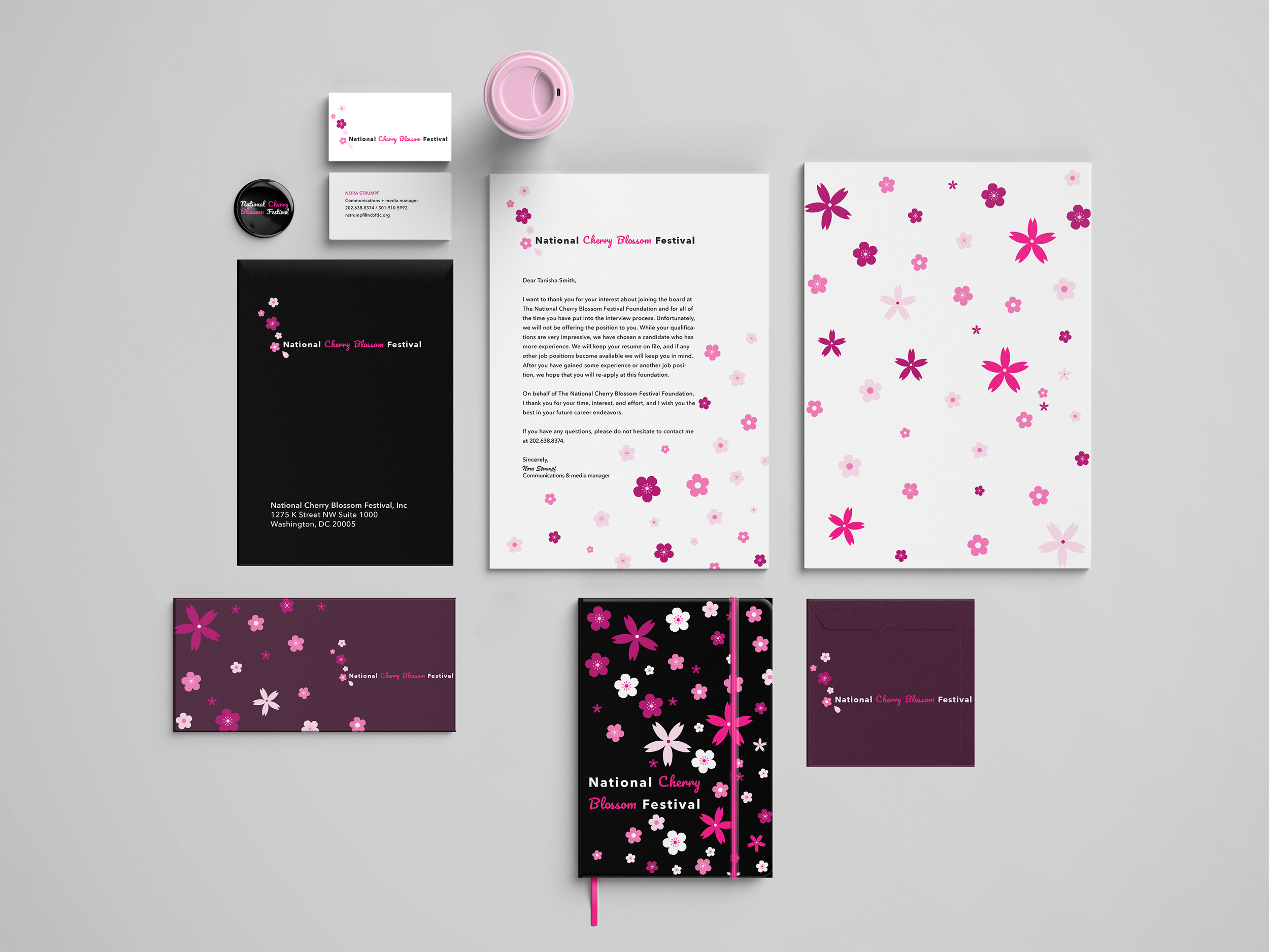
Digital stationery of the festival featuring letterheads, books, and business cards
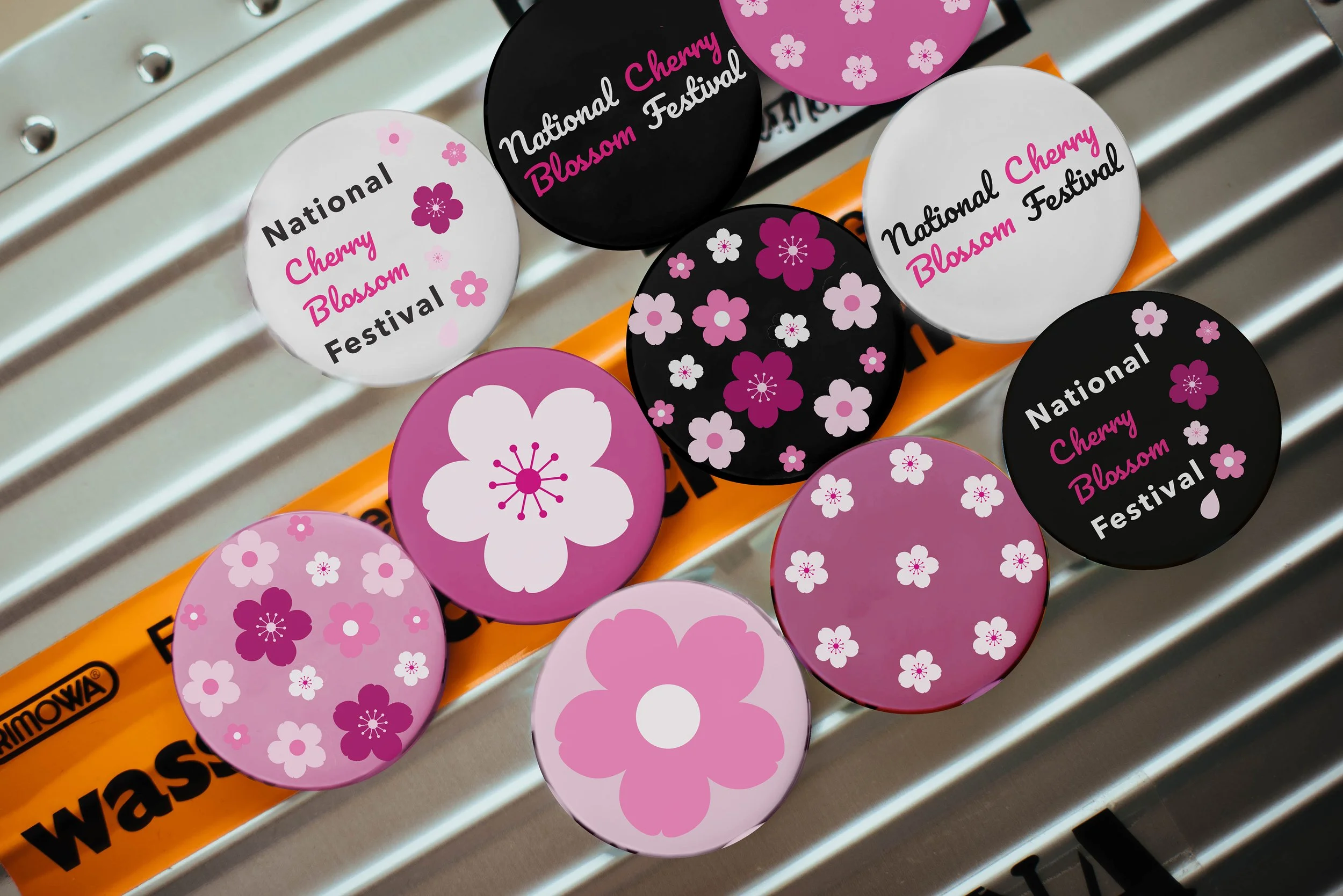
National Cherry Blossom Festival enamel pins
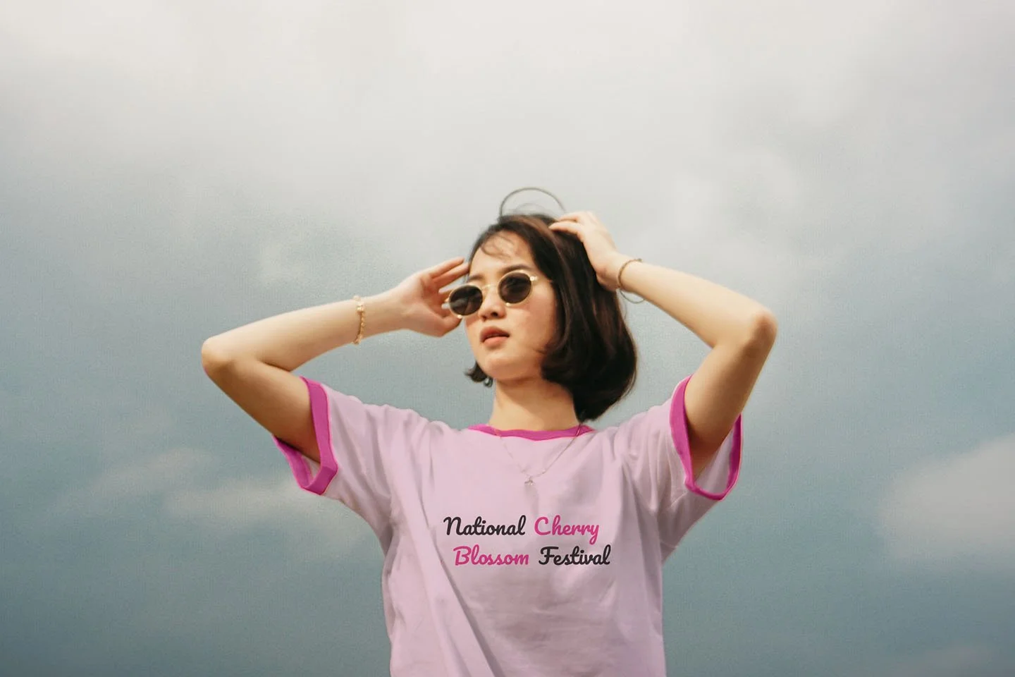
National Cherry Blossom Festival pink tshirt
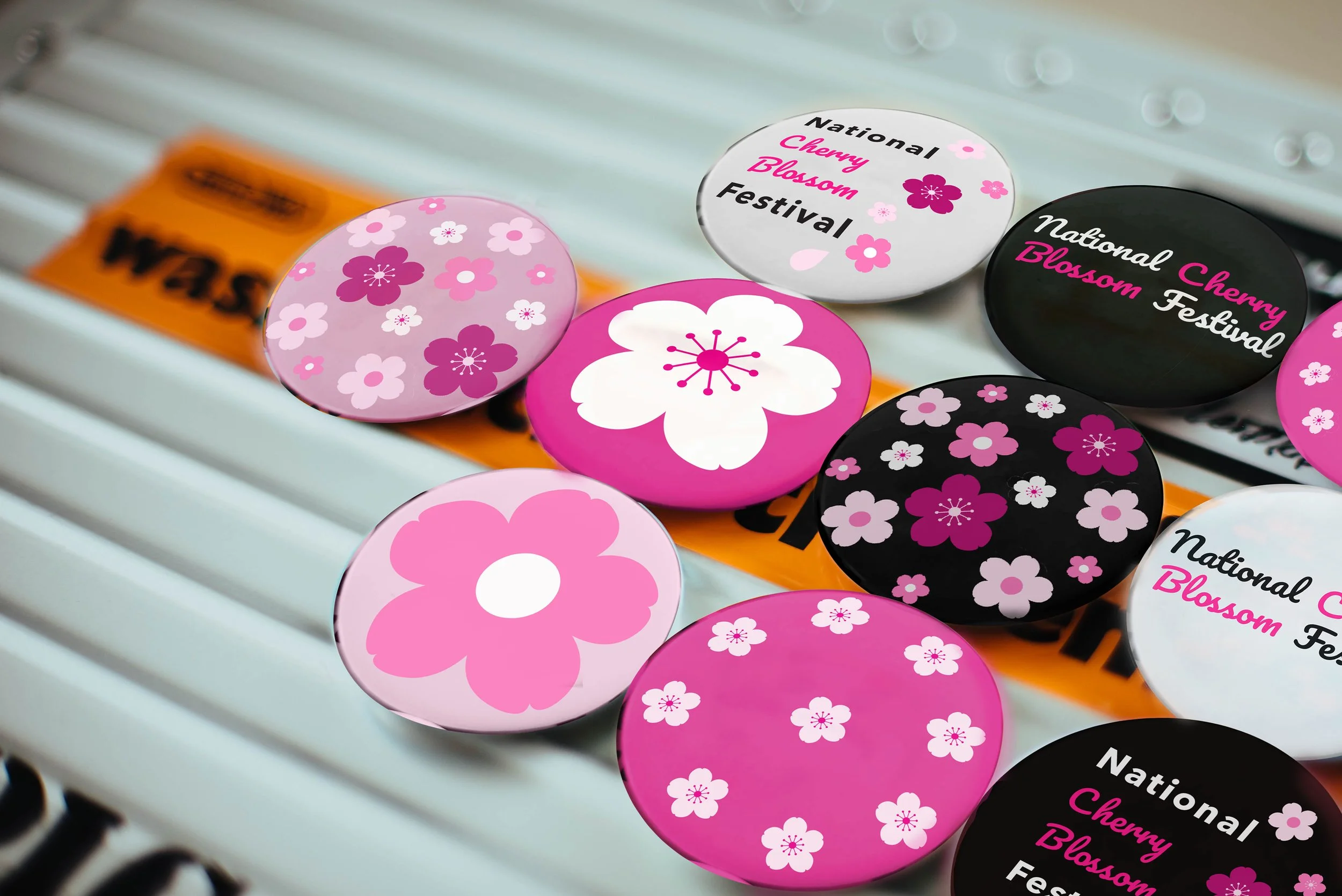
National Cherry Blossom Festival enamel pins
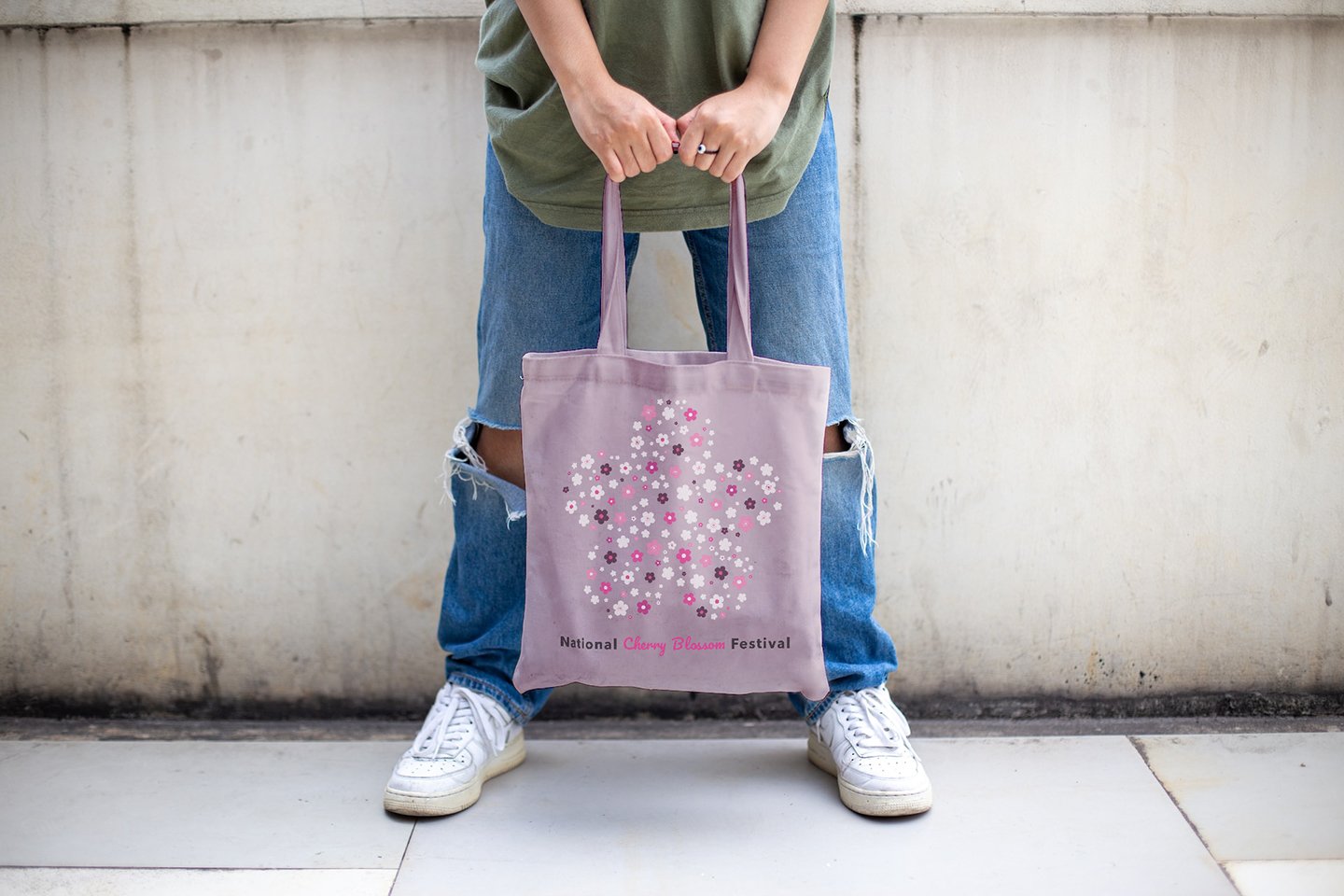
National Cherry Blossom Festival pink tote bag
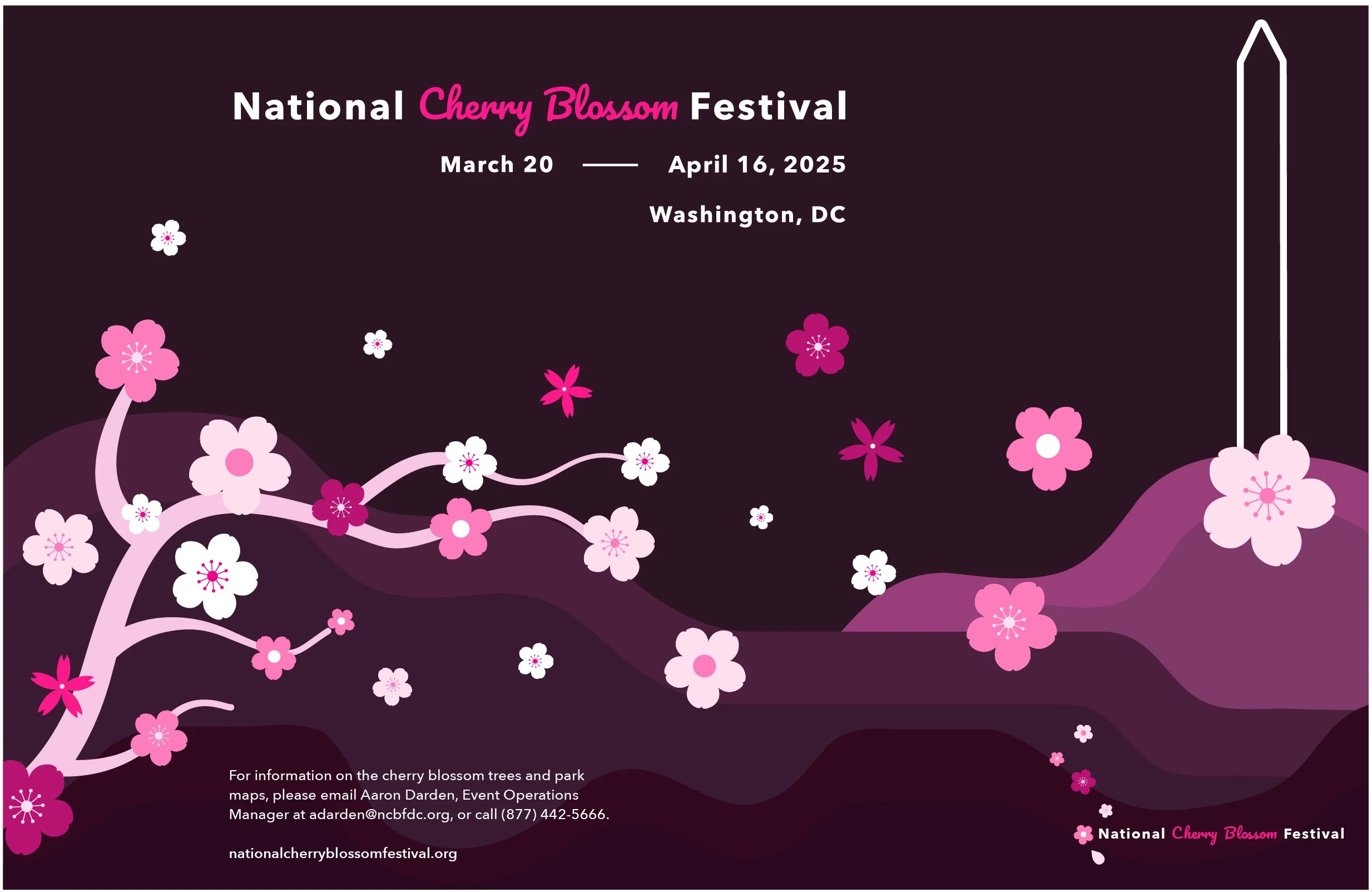
Digital poster of the National Cherry Blossom Festival
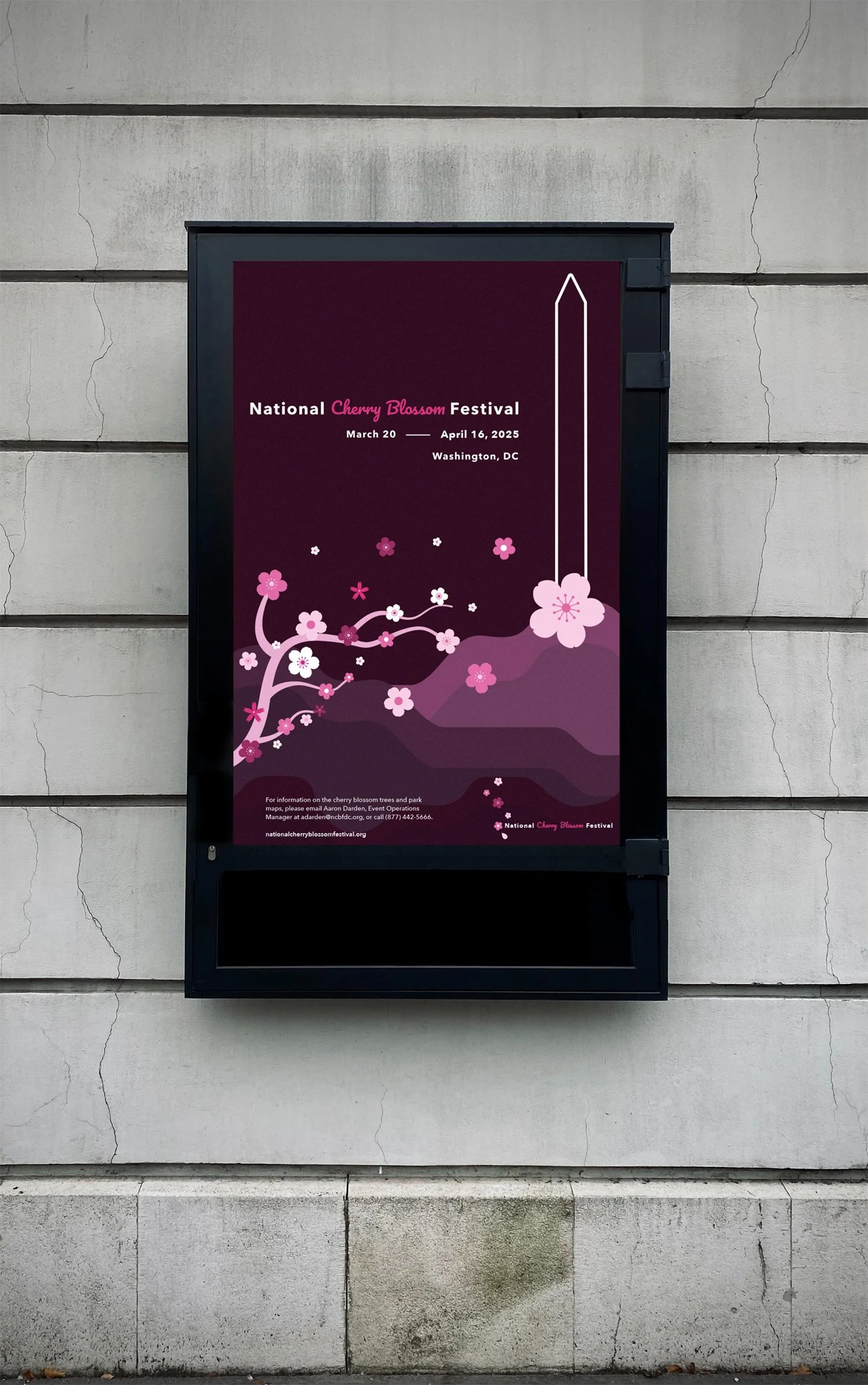
Digital mockup of the poster in public advertisement
Test
8
Presented the completed brand system for expert critique and professor feedback.
Key feedback pushed me to set the cherry blossom as the heart of the entire design system.
Exploring the flowers’ beauty to create a colorful, sensory experience rather than over-complicating the idea.
9
I was also challenged to think carefully about the political sensitivity of the Japanese-American cultural exchange — making sure the brand celebrated the relationship respectfully without reducing it to a superficial aesthetic.
The final system — modern typefaces, minimal floral elements, and a bold pink palette — created a sophisticated identity that honors its roots while speaking to contemporary audiences.
10
The final system — modern typefaces, minimal floral elements, and a bold pink palette built from different hues — created a sophisticated identity that honors its roots while feeling completely contemporary.
Key feedback pushed me to focus on the cherry blossom as the emotional and visual anchor of the entire system — leaning into its beauty to create a colorful, sensory experience rather than overcomplicating the concept.
I was also challenged to think carefully about the political sensitivity of the Japanese-American cultural exchange — making sure the brand celebrated the relationship respectfully without reducing it to a superficial aesthetic.
The final system — modern typefaces, minimal floral elements, and a bold pink palette built from different hues — created a sophisticated identity that honors its roots while feeling completely contemporary.