Raspberry Beret: Designing the Boutique and Digital Experience Through User Research
The Raspberry Beret Prototype
Role
UX Researcher
Project Type
UX research
Duration
8 weeks
Deliverables
customer journey map, sitemap, wordmap, prototype
Split-screen Comparison: Raspberry Beret legacy website vs. modern redesign concept with high-impact photography
“Information overload isn’t just a design flaw; it’s a conversion killer. Our data showed that 33% of our users walked away simply because the legacy website was too much to process.”
The Challenge
The goal was to bridge the gap between physical and digital; Raspberry Beret stores and its C2C E-commerce.
Curating a unified brand identity that showcases its aesthetics, streamlines its navigational user flows, and retain customers.
A redundant, 'bloated' site architecture with 3 separate shop pages created confusion for users and lacked a clear visual focus.
Legacy Homepage: Old Raspberry Beret website featuring a bright green sidebar menu and a text-heavy center column
The Research:
I followed a comprehensive research-to-prototype lifecycle to ensure every design decision was data-driven:
Discovery: Conducted field research and interviews.
Analysis: Performed a site audit and SWOT analysis.
Synthesis: Developed user personas, customer journey maps, and a new sitemap.
Visual Strategy: Created a moodboard and word map to define.
Iterative Prototyping: Developed three stages of prototypes (Paper, Low-Fidelity Interactive, and High-Fidelity Functional).
User Journey map: 'Stylish Sheryl' persona tracking emotional phases and pain points during checkout
Wordmap: Brand discovery for Raspberry Beret with clusters for Vintage, Modern, and Eclectic attributes
Sitemap: A streamlined navigation map designed to reduce user friction and "navigational bloat"
The Solution
The final design works because it prioritizes visual discovery over textual clutter.
Based on usability testing, I consolidated 3 separate shop links into a single, high-impact 'Pictorial Shop' page, that reduced user friction.
To maintain brand equity, I evolved the original 'pink' palette into a modern, vibrant system. I paired Leckerli One (for personality and brand voice) with Avenir Book (for clean, legible body text).
This balance of eclectic color and minimalist layout ensures that the vibrant clothing items remain the focal point without competing with the UI.
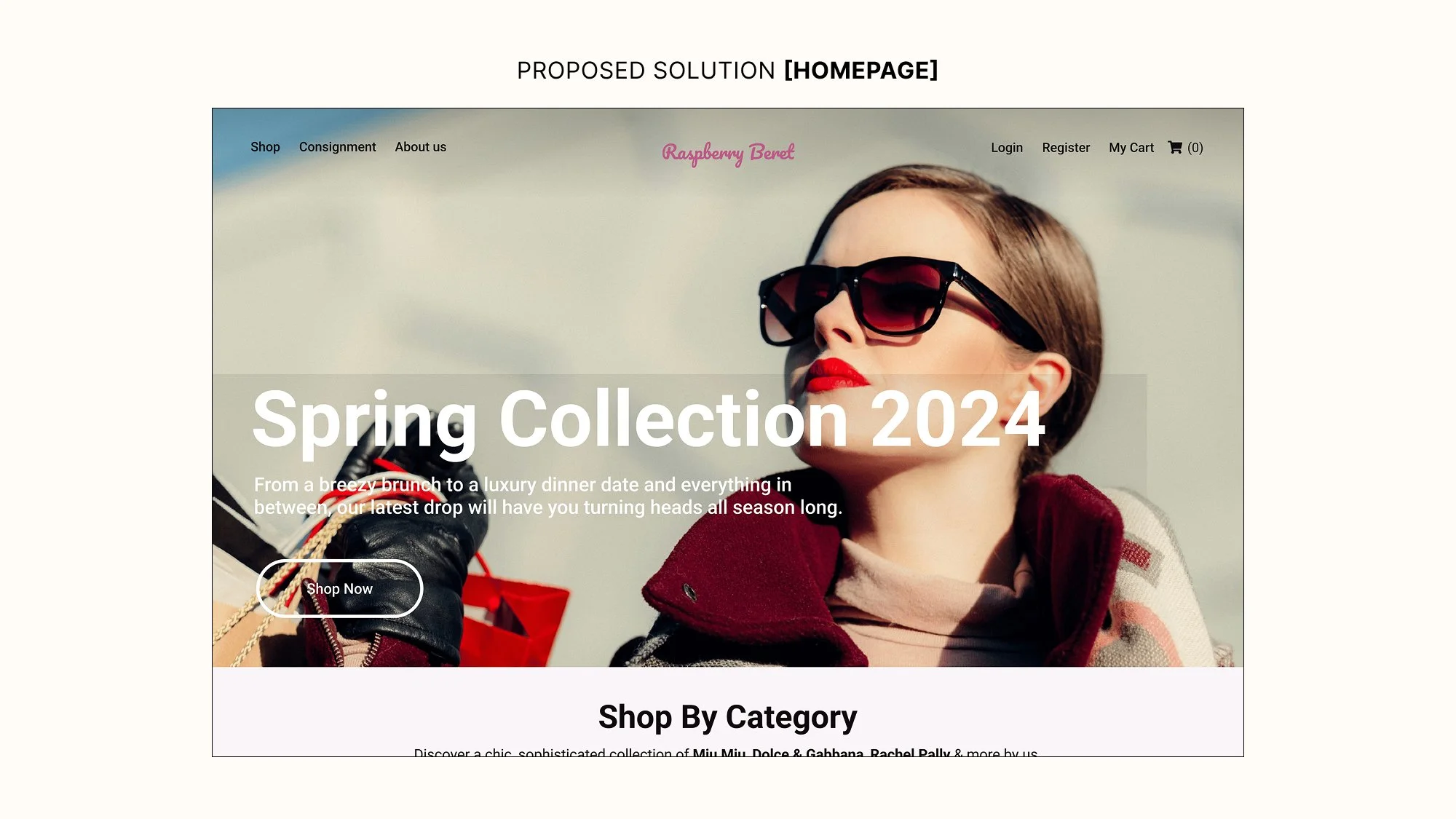
Proposed Solution: new homepage with a clean headline and minimal text for better readability