Hybrid Vigor: Remixing the Visual Design of a Bi-cultural Tradition
The National Cherry Blossom Festival

DIGITAL POSTER OF THE EVENT
Role
Brand designer
Project Type
Brand Identity
Duration
6 weeks
Deliverables
Logo, mockups, poster, sitemap, merch
Prologue
Problems
The National Cherry Blossom Festival was a major cultural event that draws national and international visitors to Washington, D.C.
It deserved a brand identity as bold and vibrant as the festival itself.
The goal was to honor its historical roots while creating something new that resonated with people across all cultures.
Objectives
My job was to take an 1912 event and make it appeal to a 2025 modern audience.
The challenge was honoring over a century of history and remixing the brand into something new.
The new brand system needed to work everywhere; logos, posters, stationery, merchandise, and digital touch points.
Goals
Honoring the Japan-American cultural ties and Washington DC's identity while making it feel relevant for today’s audience.
Build a complete design system from the ground up; logos, festival posters, stationery, merchandise, and mockups.
“In Spring, we celebrate the day of March 27, 1912; The day when Japan gave cherry blossoms trees to the United States of America.”
Define
Research
Create
Test
Define
1
The cherry blossom isn't just a flower. It is the national flower of Japan.
It’s also the centerpiece of this major event that brings visitors from all across the world.
Sketched drawings of flowers, stars, fireworks and using white space to explore joy and celebration.
2
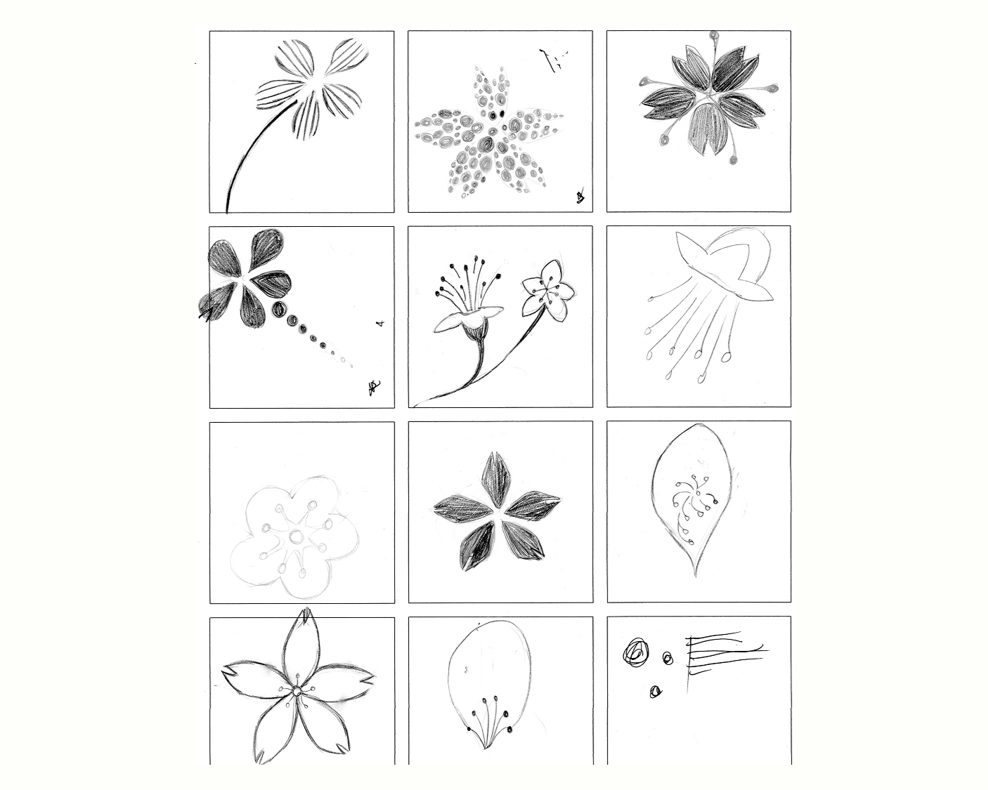
Sometimes, I used the whole flower and other times, just the petals.
Simplifying my flowers into basic shapes and using movement to express joy.
There’s sketches of flowers shooting out like fireworks.
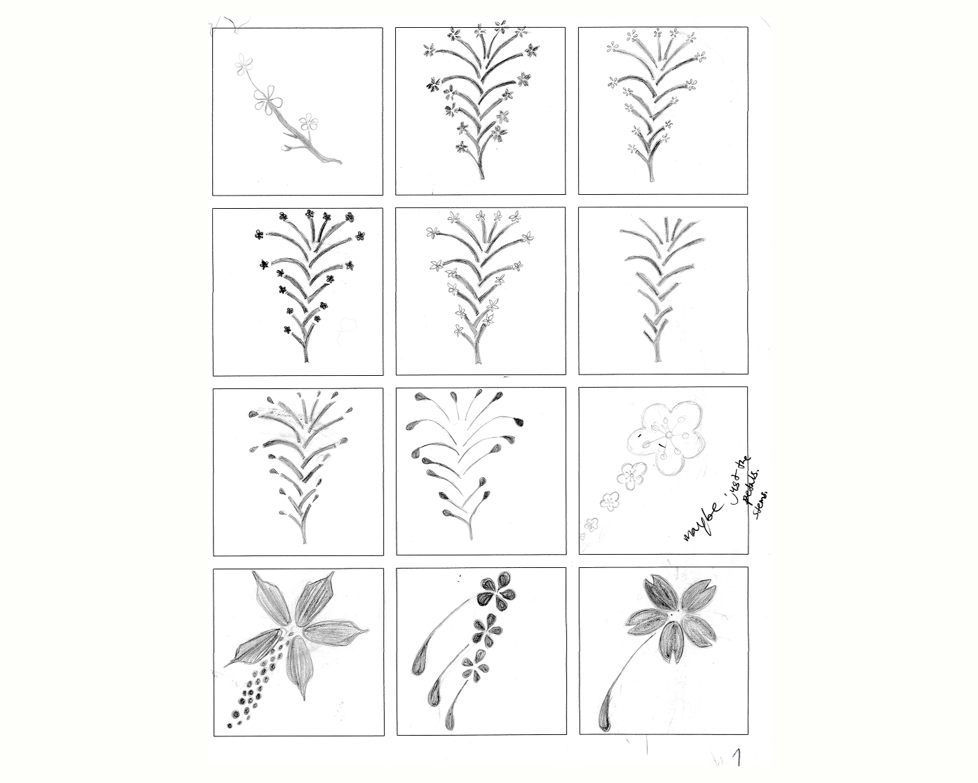
ROUGH SKETCH OF FLOWERS & FIREWORKS
ROUGH SKETCH OF FLOWERS & FIREWORKS
Research
3
Using word association and spider mapping to explore the relationships between Japan, the USA, Washington D.C., and the cherry blossoms.
These four subjects share a connection with each other through their past and present.
Making a successful list and choosing words that people can visualize in their minds.
4
The cherry blossom is the foundation I build my system from; using pink as the main color.
My design uses a bold, colorful palette using sans serif and script typefaces.
San-serif show a contemporary feel while the script typeface adds a touch of antiquity.
Dug into the history of the festival to understand what it actually represents.
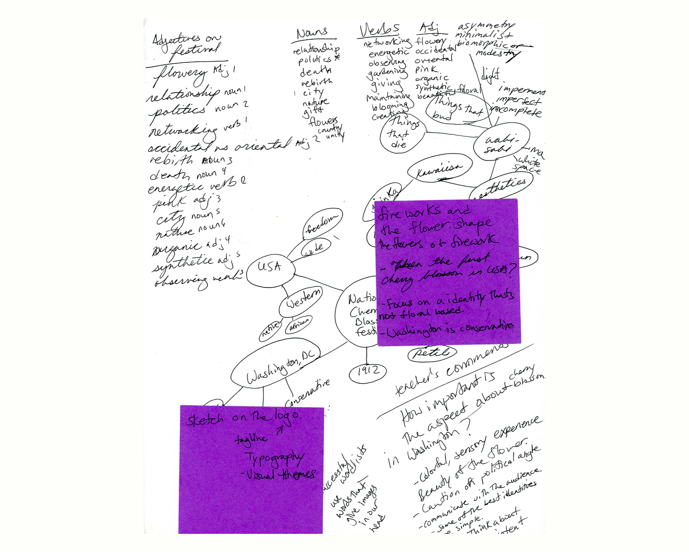
WORD MAP & SPIDER MAP OF FESTIVAL
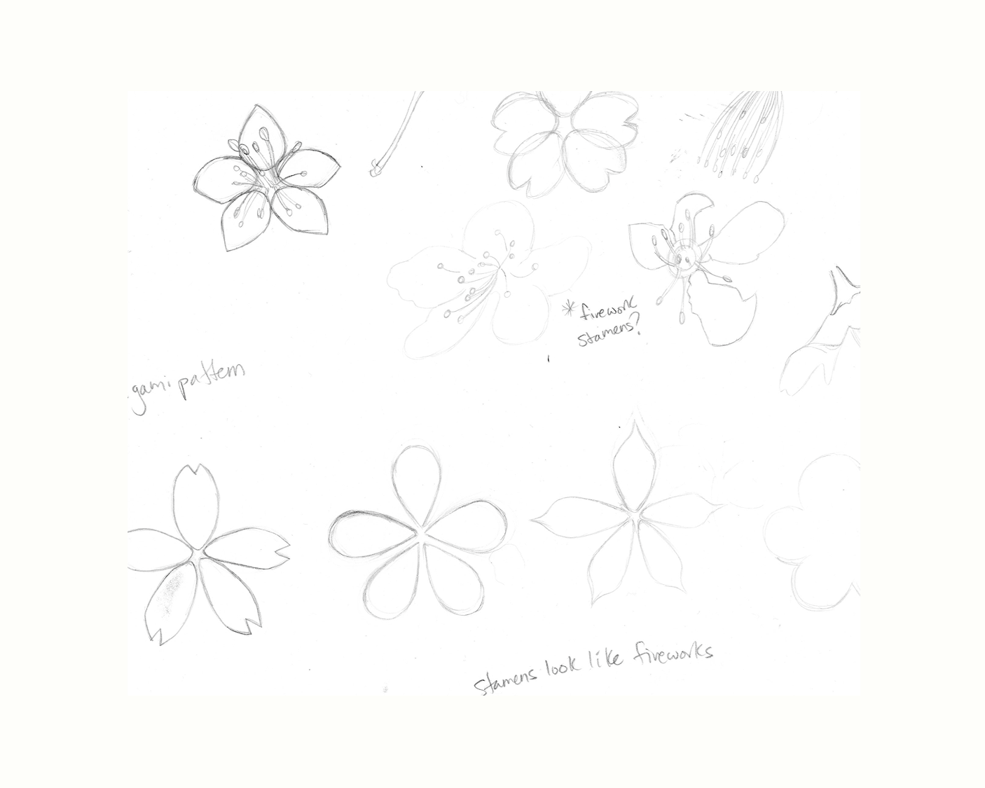
ROUGH SKETCH OF FLOWERS & PETALS
Create
5
It wasn't just about making things look pretty; it was using my research to communicate with clarity and cultural respect.
The festival carries huge cultural and political implications between Japan and the United States.
So, the design must celebrate that relationship with careful consideration.
6
The Deliverables include digital logos, posters, stationery, merchandise, and mockups.
It’s built to communicate consistently across all touch points.
I admired how the previous brand campaign paired sans serif and script typefaces effectively, so I continued the trend and made it my own.
7
Using different hues of pink to create a colorful experience completely centered around the cherry blossom.
Simplicity was always the goal. Some of the best brand identities in the world are the most subtle.
Cherry blossoms are already beautiful enough to carry the design on their own.
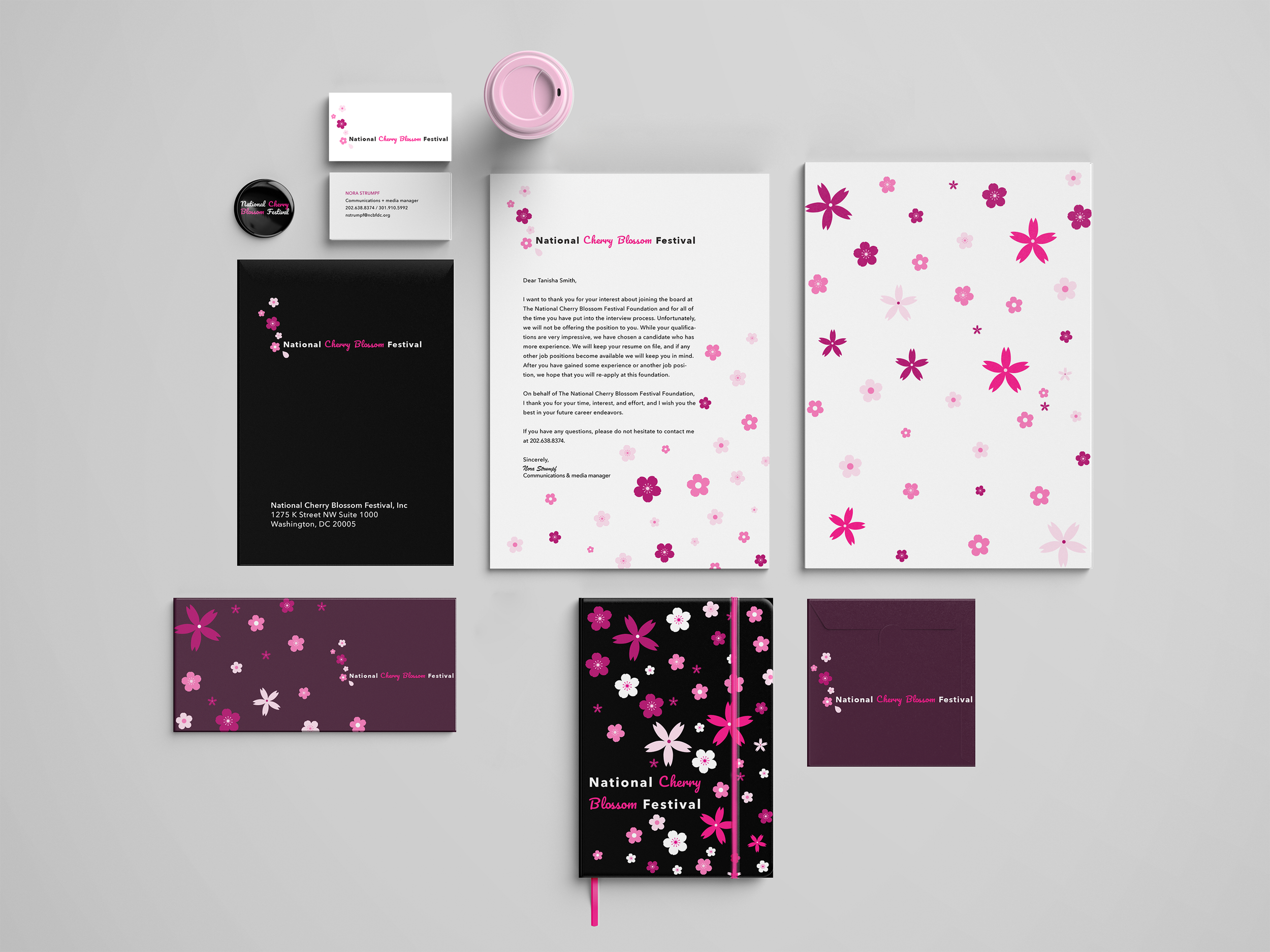
DIGITAL STATIONERY FOR THE FESTIVAL
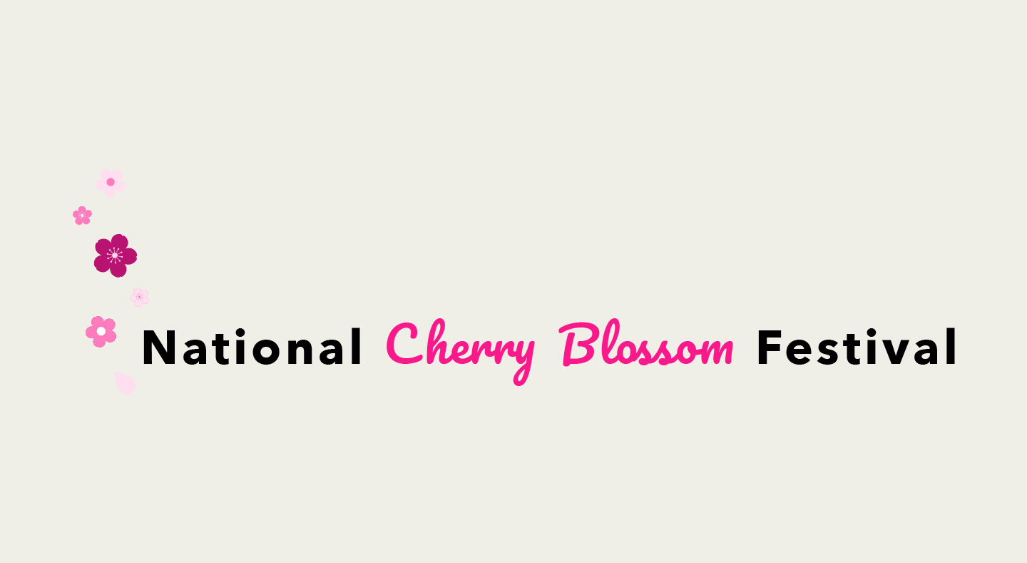
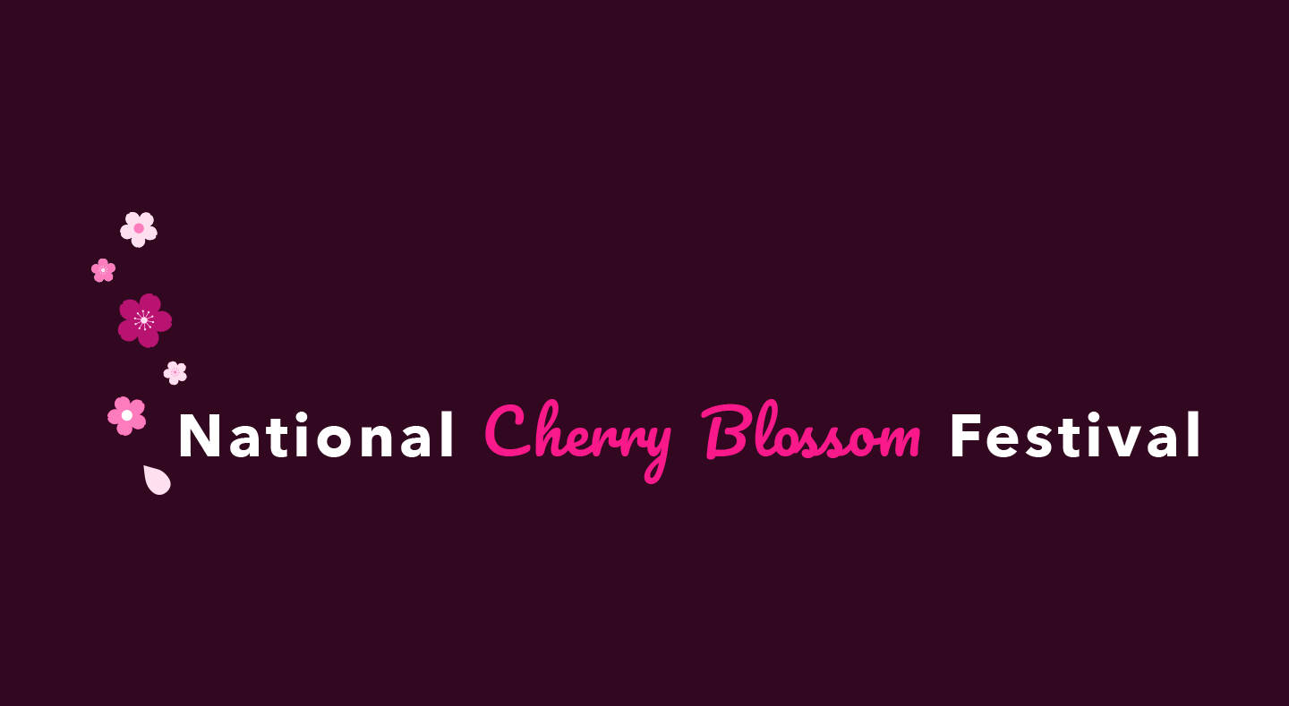
LOGO FOR THE NATIONAL CHERRY BLOSSOM FESTIVAL
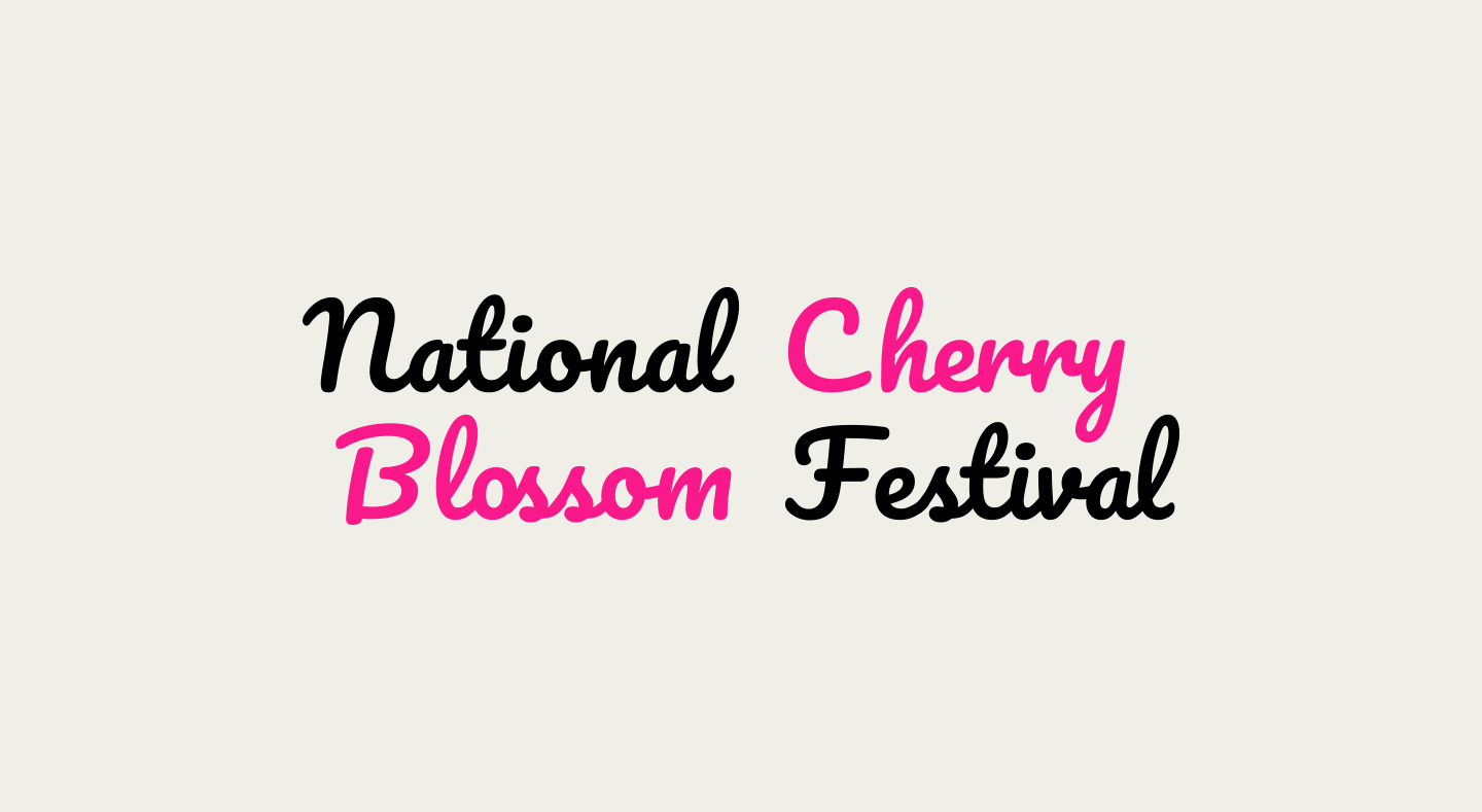
VARIANT LOGO FOR THE NATIONAL CHERRY BLOSSOM FESTIVAL
VARIANT LOGO FOR THE NATIONAL CHERRY BLOSSOM FESTIVAL
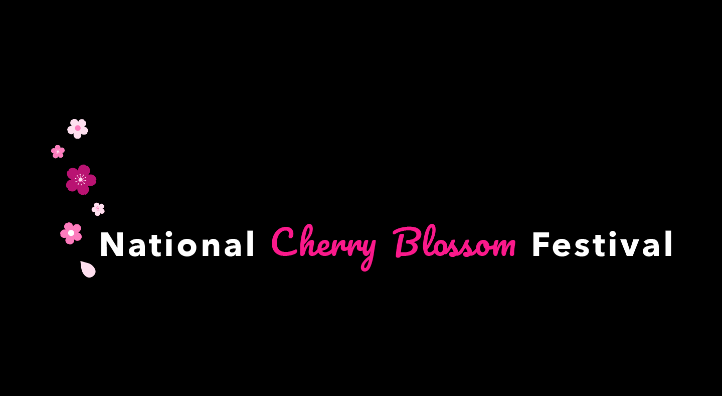
VARIANT LOGO FOR THE NATIONAL CHERRY BLOSSOM FESTIVAL
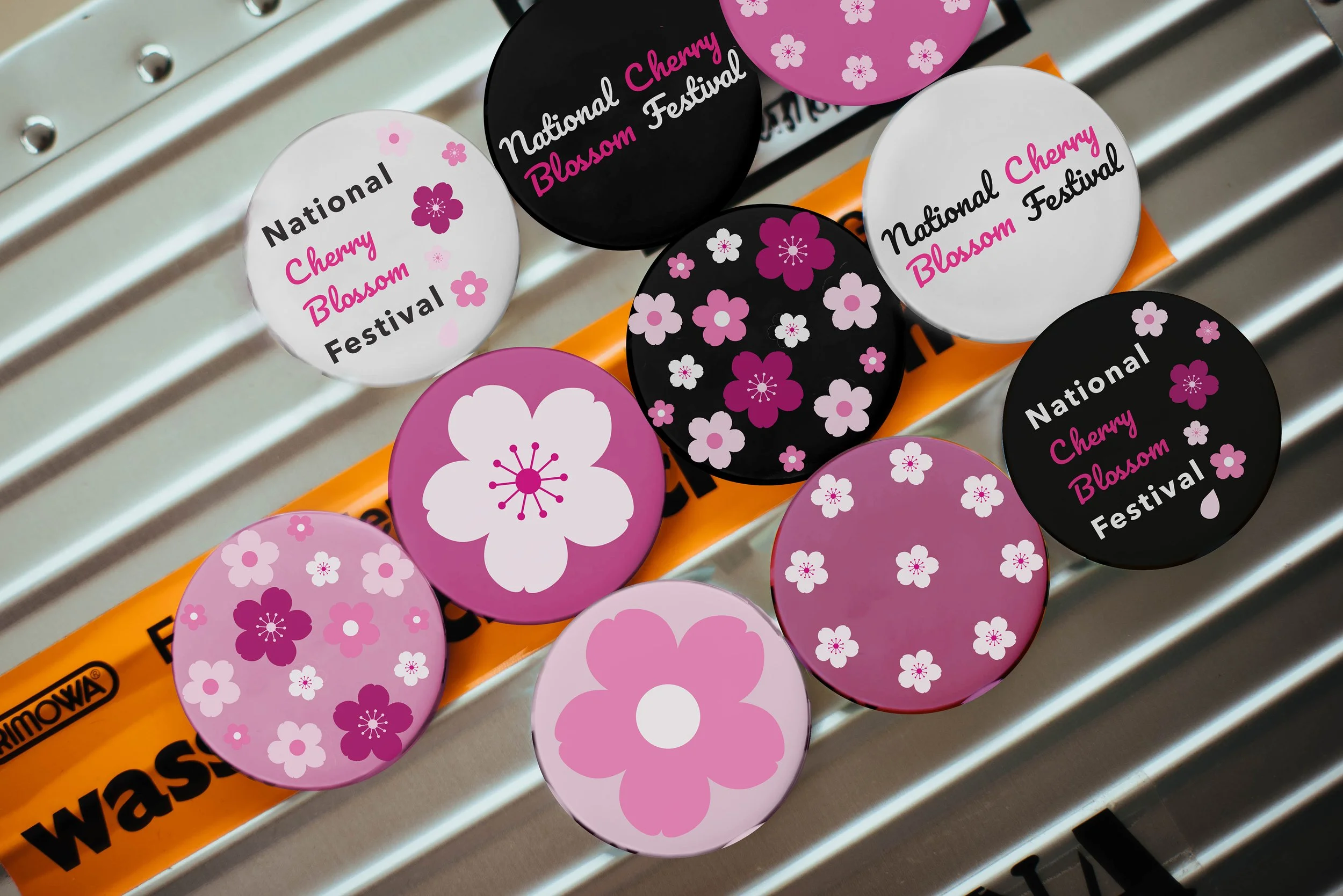
ENAMEL PINS WITH FLOWER DESIGNS
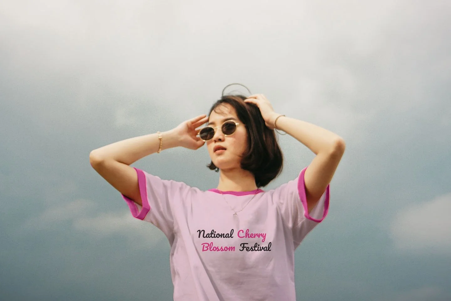
T-SHIRT PINS WITH NATIONAL CHERRY BLOSSOM FESTIVAL LOGO
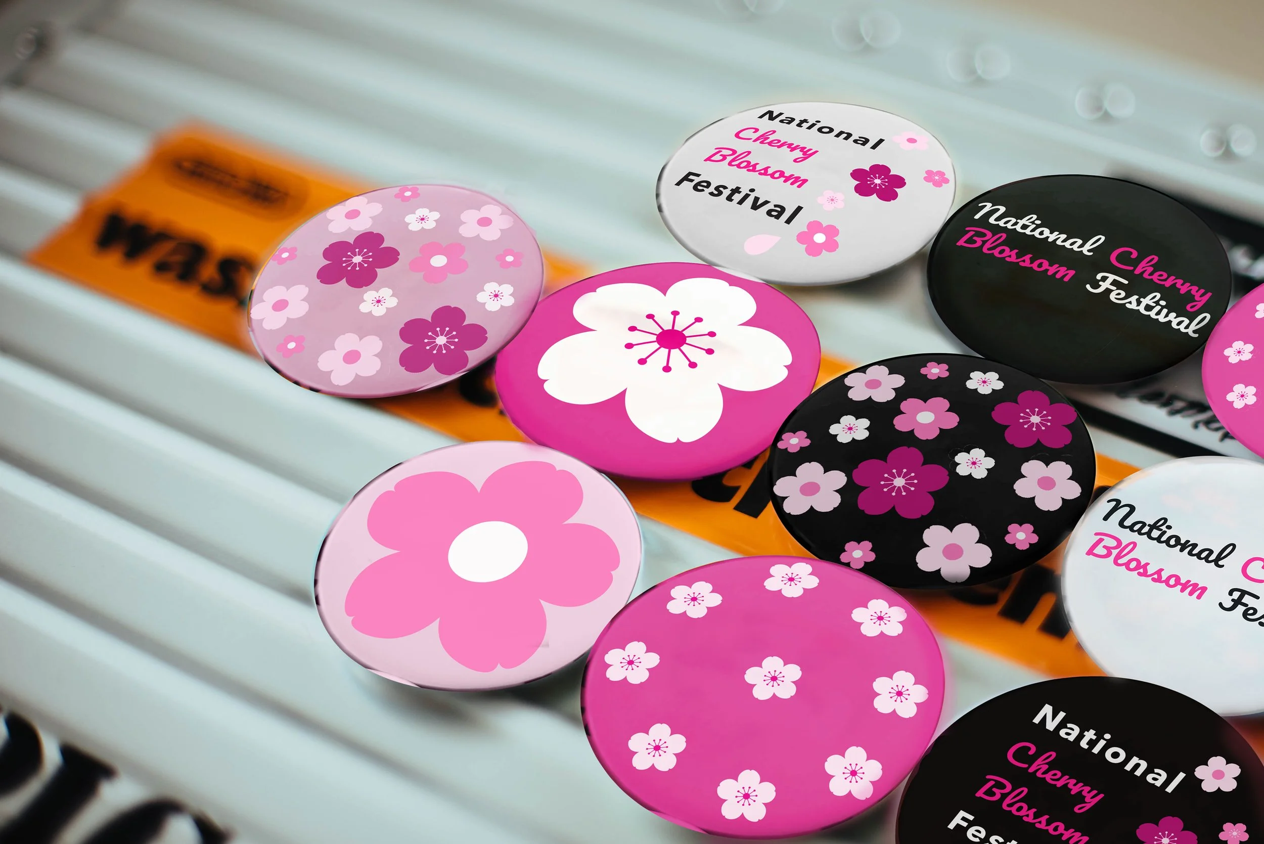
ENAMEL PINS WITH FLOWER DESIGNS
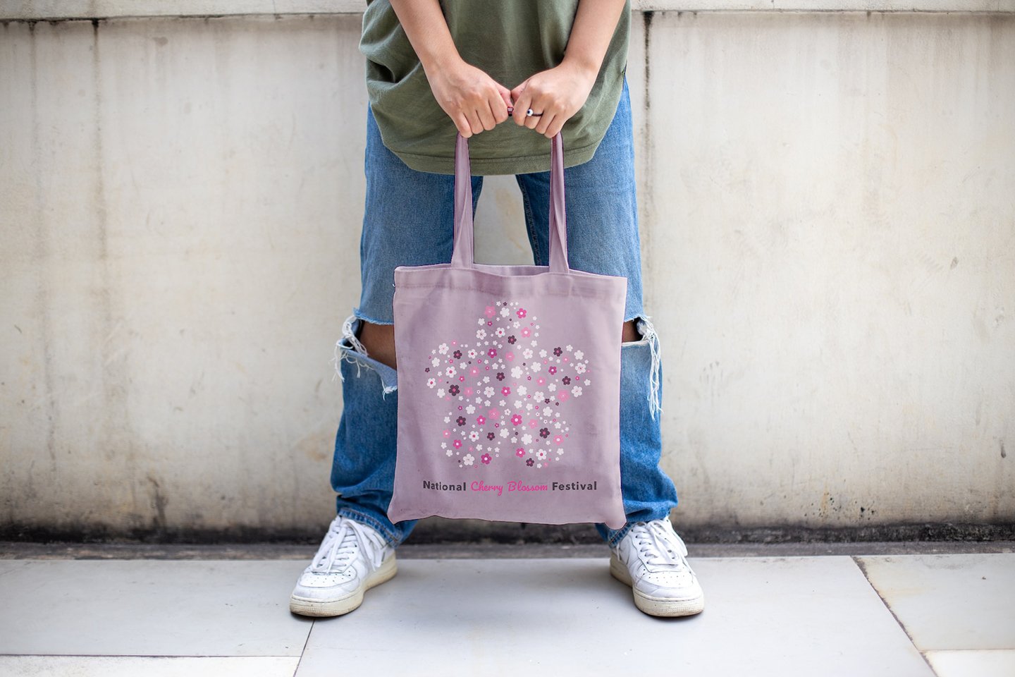
TOTE BAG WITH FLOWER DESIGNS
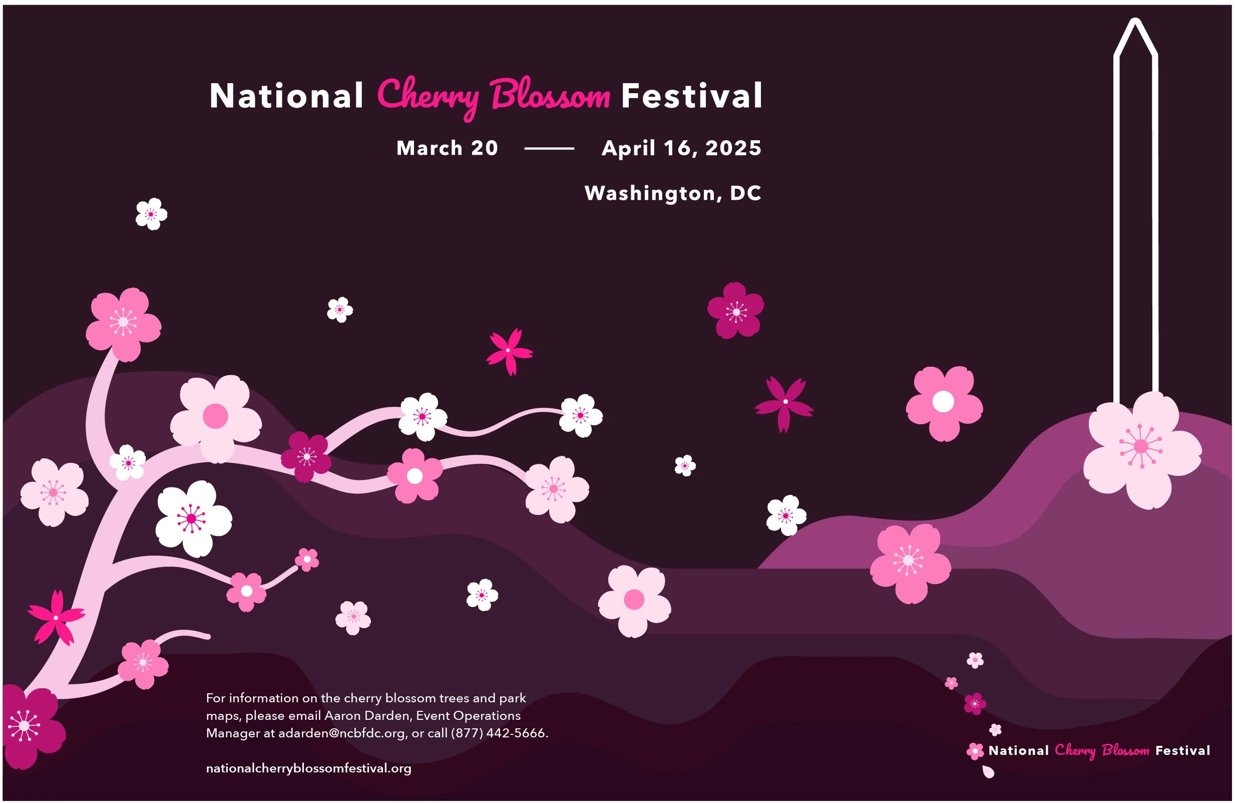
DIGITAL POSTER OF THE EVENT
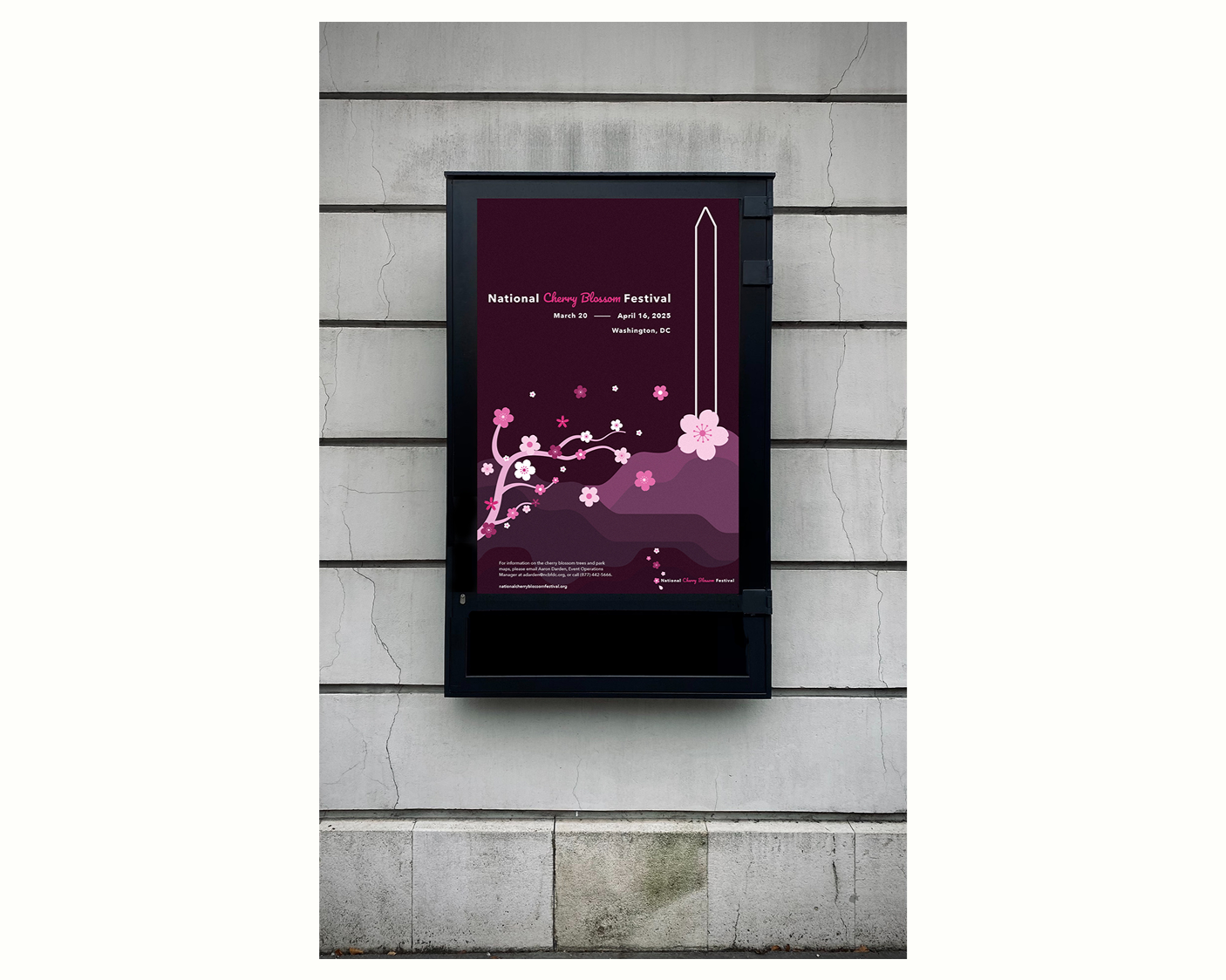
DIGITAL MOCK-UP OF THE POSTER
Test
8
Presented the completed brand system for expert critique and professor feedback.
Key feedback pushed me to set the cherry blossom as the heart of the entire design system.
Using the flowers’ beauty to create a colorful and sensual experience instead of over-complicating it.
9
I was also challenged to think carefully about the political nature of the Japanese-American cultural exchange.
Treading carefully to make sure the brand celebrated the relationship respectfully without reducing it to something superficial.
10
The final design system has modern typefaces, minimal floral elements, and a bold pink palette.
Using the different hues of pink created a sophisticated identity that honors its roots while keep the brand fresh.