Unifying the National Museum of Play: From Brand Fragmentation to Visual Cohesion
The National Museum of Play
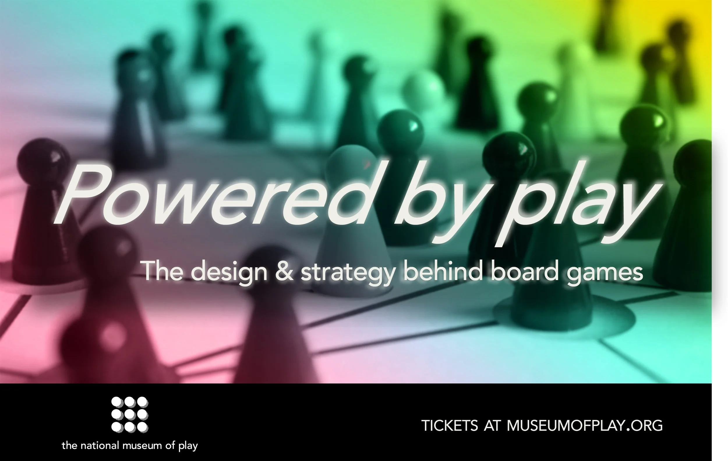
DIGITAL POSTER OF THE EVENT
Role
Brand designer
Project Type
Brand identity
Duration
6 weeks
Deliverables
Logo, Poster, Stationery, Mockups, Merch
Prologue
Problems
The previous brand was inadequate. It failed to capture the full value of what this organization actually offers.
The academic side of play was completely overlooked.
This isn't just a museum. It's a library, a preschool, an educational institution, and home to a butterfly garden. That's a lot to leave off the table.
Marketing to one demographic left money on the table and missed opportunities.
Objectives
Unifying the National Museum of Play brand under one umbrella.
A flexible design system that can be applied to all the institutions.
Representing the idea of playfulness; The challenge of communicating with subtlety instead of the obvious.
Advocating its mission of representing the history and the study of play that promotes the academic institutions and the preschool.
Goals
Making sure this rebrand appeals to adults, too.
People do appreciate clever jokes and play isn’t just physical; it’s cognitive as well.
Building a design system that serves the organization’s needs.
The brand must advocate its own mission and communicate the real value of play.
“Play touches and stimulates vitality, awakening the whole person—mind and body, intelligence and creativity, spontaneity and intuition. ”
Define
Research
Create
Test
Define
1
The museum is one of six institutions that make up The Strong Organization.
It was started by philanthropist Margaret Woodbury Strong. It’s a popular place that brings in millions of visitors.
It started as a museum but, now includes a library, a preschool, an academic institution, and is home to a butterfly garden.
The organization writes the benefits of play in scientific journals but why isn’t this being reflected in their brand?
2
The museum's history and academic work was being left out.
Aiming to unify the relationship between the museum and the other institutions.
Having a brand wasn’t enough; it needed a new identity that embodies “play” and can market itself to two opposing demographics.
Approaching this project as a challenge to communicate play that covers these areas.

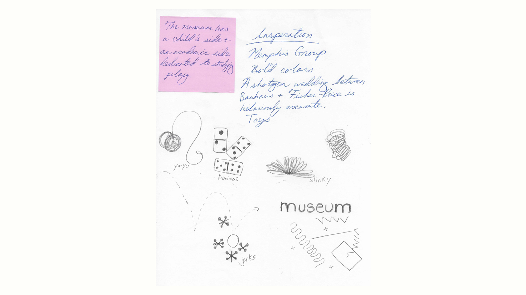
ROUGH SKETCH OF LOGO AND IDEAS
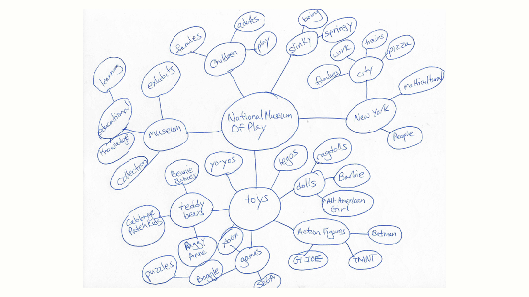
SPIDER MAP OF THE NATIONAL MUSEUM OF PLAY
Research
3
Noticed the gap when I studied the museum’s history across all of its institutions.
They were all part of the same community but the brand didn’t show that.
The museum was founded by a woman who collected dolls as her lifelong hobby.
That says everything about who the real audience should be.
Adult toy collectors are being ignored and they shouldn’t because most toy purchases are made by adults.
4
Used word association and spider mapping to explore the relationships between the museum, its institutions, toys, and the concept of playfulness.
Building a foundation from that direction and figuring out how to show playfulness without being obvious.
After sketching dozens of toys, I noticed they all shared a thing in common; circles.
Balls, yo-yos, dominoes; circles were everywhere.
5
The core idea is to show play through motion and shapes.
Using random circles, zigzags, and lines to create a brand of organized chaos.
The typography was kept simple.
I developed 13 logo ideas. It was tough designing something that satisfy both group at once.
ROUGH SKETCH OF LOGO AND IDEAS
ROUGH SKETCH OF LOGO AND IDEAS
Create
6
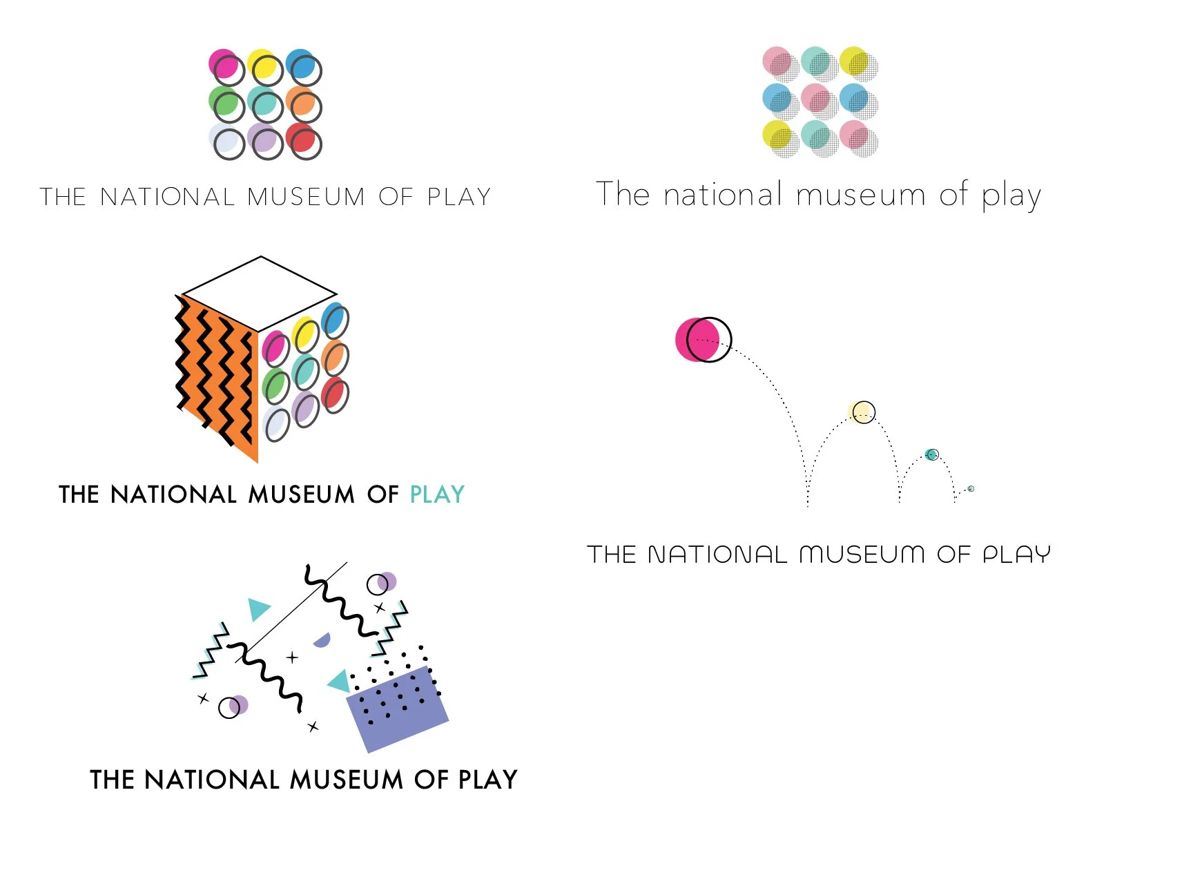
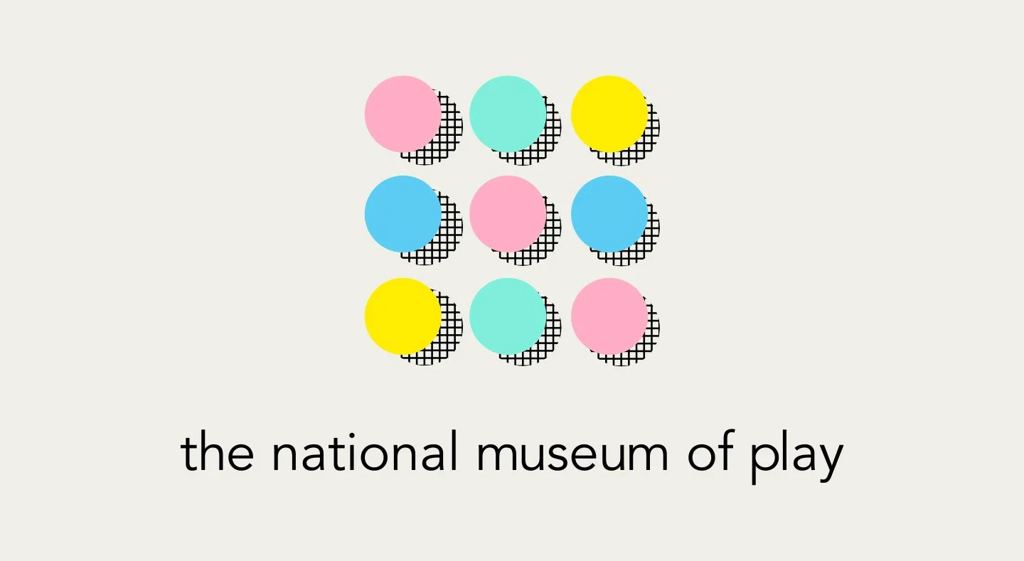
The logo is the heart of everything.
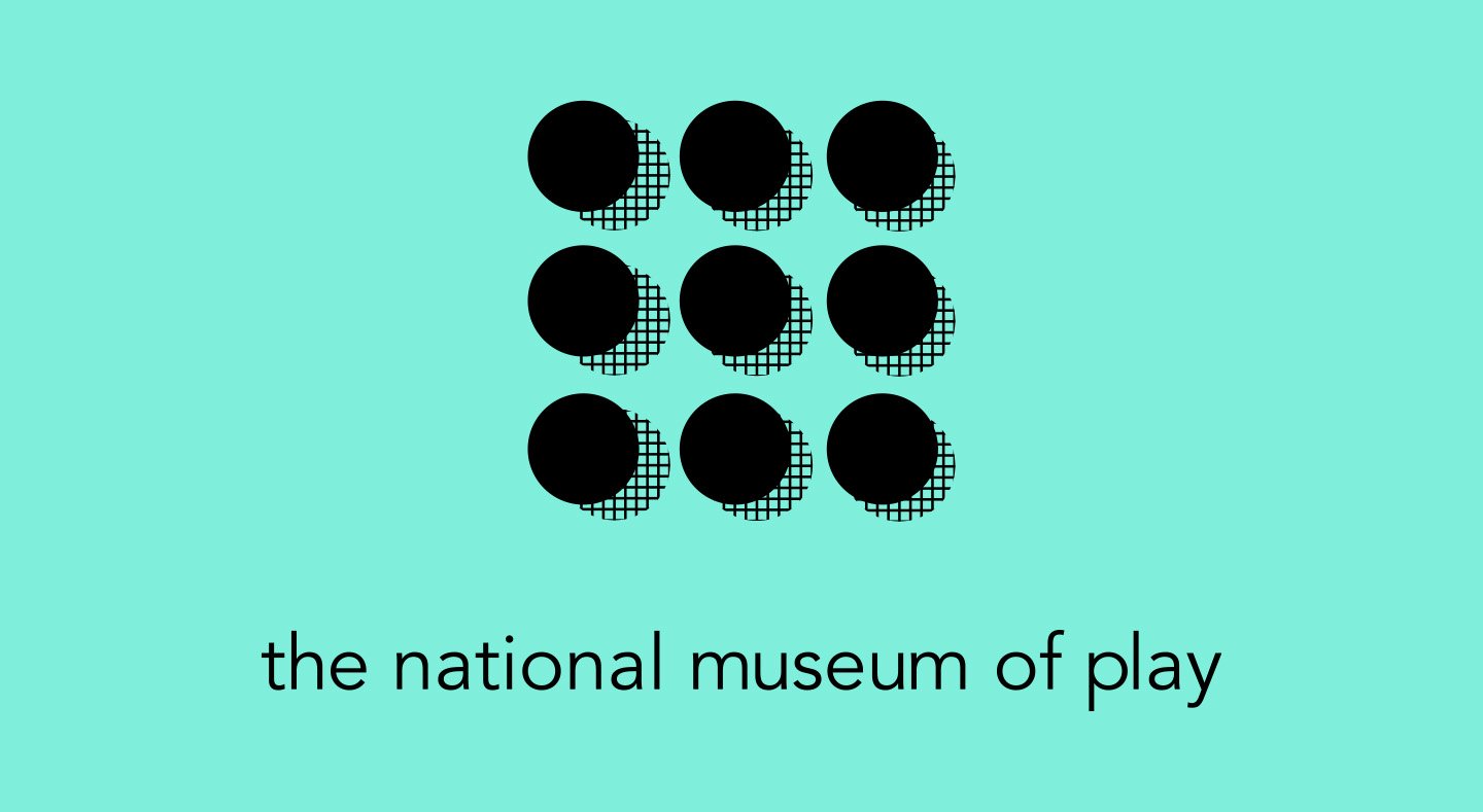
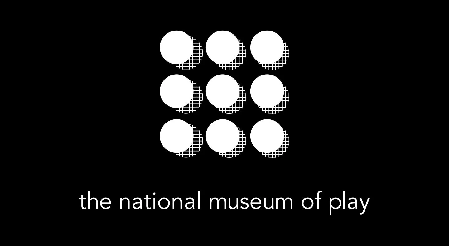
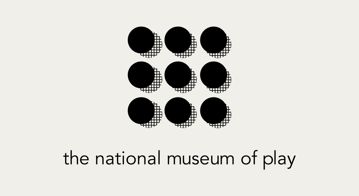
Nine circles arranged in a 3x3 grid representing play through motion, form, and rhythm rather than a literal toy.
The circle was everywhere in my research: balls, yo-yos, dominoes.
It was the symbol for play without being so obvious about it.
Communicating energy, motion, and playfulness through abstraction rather than illustration.
The random shapes, lines, and zigzag elements weren't decorative.
7
The full deliverables included digital logos, posters, stationery, merchandise, and mockups;
A complete brand identity built to work.
The goal was making a palette that a child would love and an adult toy collector wouldn't be embarrassed by.
Choosing pastel pink, teal, yellow, and blues were excellent because these colors grab people’s attention.
They’re bold enough to feel energetic but, soft enough to feel fancy.
8
Avenir Book complemented the logo without competing with it.
Typography to be the quiet kid in the classroom with chaos happening in the background.
The biggest surprise was how well it all came together.
I wasn't sure how the idea would come out.
It feels unified, thoughtful, and fun. Never had to show a single toy.
They were designed to feel like bold, colorful, and alive
ROUGH SKETCH OF LOGO AND IDEAS
LOGO FOR THE NATIONAL MUSEUM OF PLAY
VARIANT LOGO FOR THE NATIONAL MUSEUM OF PLAY
VARIANT LOGO FOR THE NATIONAL MUSEUM OF PLAY
VARIANT LOGO FOR THE NATIONAL MUSEUM OF PLAY
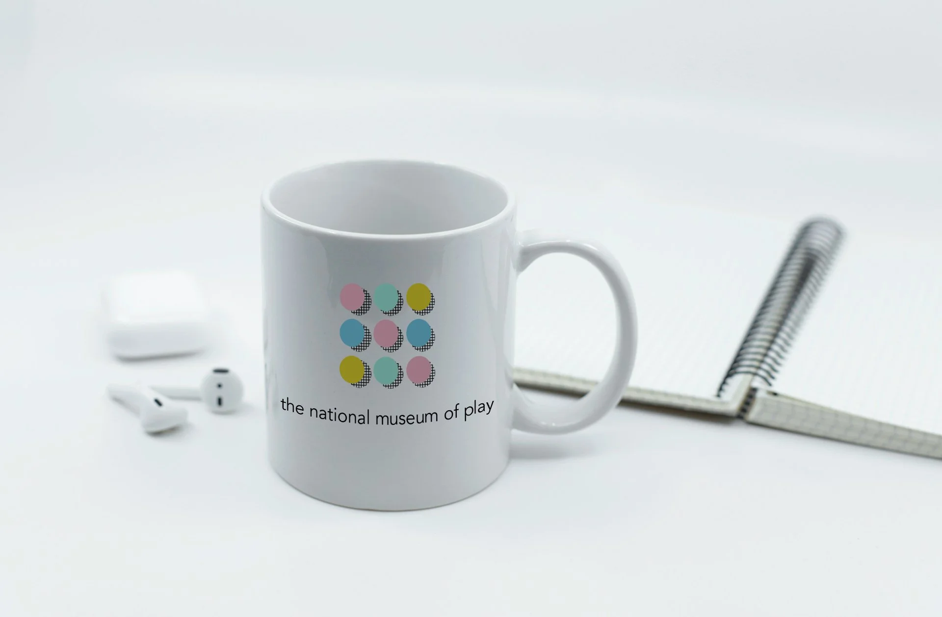
CUP WITH THE NATIONAL MUSEUM OF PLAY
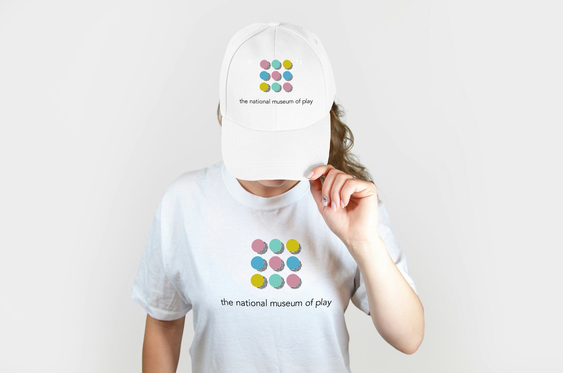
T-SHIRT & HAT WITH THE NATIONAL MUSEUM OF PLAY

CUP WITH THE NATIONAL MUSEUM OF PLAY
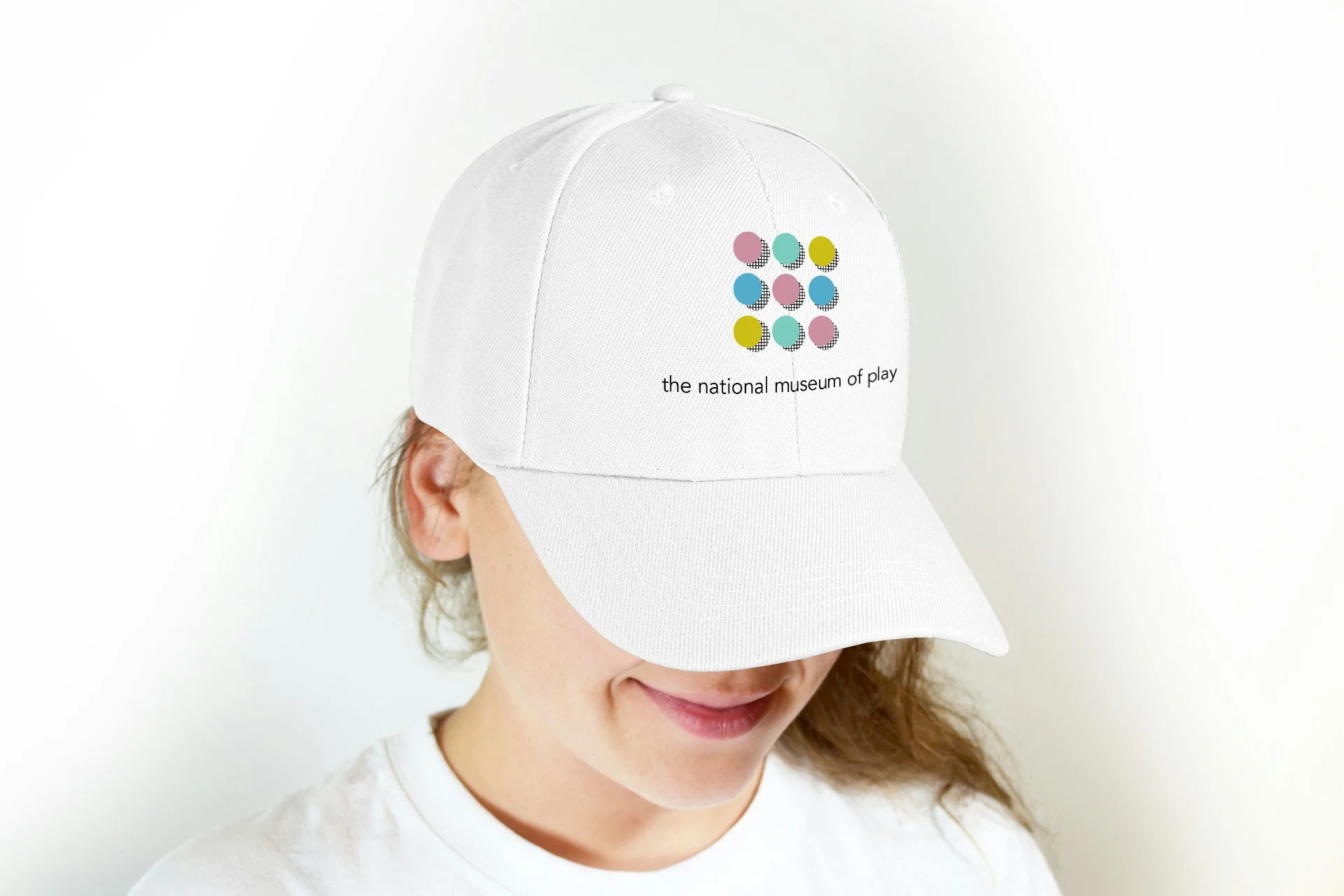
HAT WITH THE NATIONAL MUSEUM OF PLAY

DIGITAL POSTER OF THE EVENT
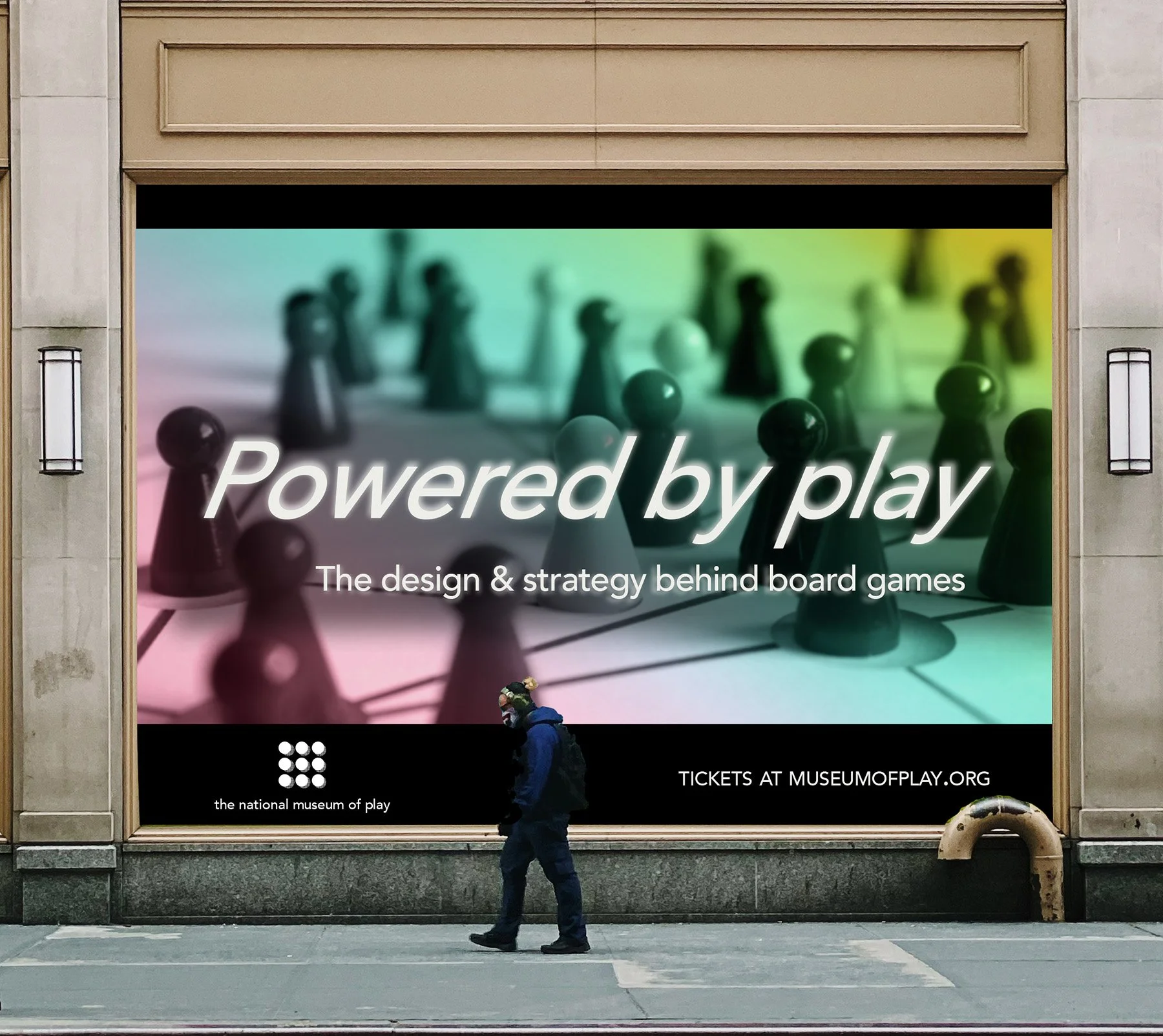
DIGITAL MOCK-UP OF THE POSTER
Test
9
Presented the completed brand system to my professor for critique and feedback.
It did the job and the simple typography was the right call given how much energy the logo already carries.
Letting Avenir Book sit quietly underneath the circle grid was exactly the balance the system needed.
10
The brand successfully bridged the gap between the museum and all of its institutions.
Creating a sense of community across everything from the library and archives to the preschool and butterfly garden.
The system achieved what it set out to do: communicating playfulness.
Bold enough for kids, sophisticated enough for the adults.
11
If I could go back and change one thing, I would make the logo more dynamic like I did in The National Cherry Blossom Festival.
A single static logo works, but I think a dynamic logo pushes it further.
A dynamic logo pushes the energy of the brand even further and kept it from feeling repetitive across applications.